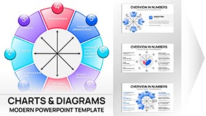
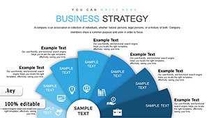
Empower your strategic initiatives with our specialized Keynote charts for strategic management. These tools are designed for executives, consultants, and team leaders to map out objectives, assess risks, and track progress in a visually compelling manner.
From SWOT analyses to balanced scorecards, each chart template simplifies complex frameworks into intuitive graphics, compatible with Apple`s Keynote for effortless editing. Whether outlining competitive positioning or resource allocation, these assets help articulate visions that inspire alignment and execution.
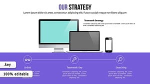
Targeted at professionals navigating corporate landscapes, our charts blend analytical rigor with aesthetic appeal, using clean lines and color-coded segments to highlight priorities. Save hours on design while focusing on what matters: turning strategies into actionable outcomes.
Transform ideas into impact - select a chart template and refine your approach now.
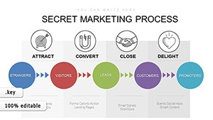
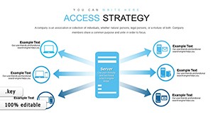
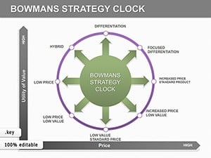
Strategic charts excel in board meetings, where a pyramid diagram can layer corporate goals from vision to tactics, or in workshops dissecting Porter`s Five Forces. Consultants use them for client deliverables, visualizing market entry barriers with radar charts for multidimensional insights.
In educational settings, they aid MBA courses by breaking down BCG matrices, enabling students to simulate portfolio decisions interactively.
These uses foster strategic clarity across hierarchies.
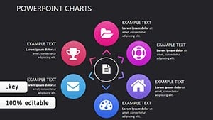
Keynote`s built-in charts lack strategic-specific icons and layouts, often resulting in cluttered outputs. Our templates provide pre-configured structures like Ansoff matrices, cutting customization time in half and ensuring consistency. They also support layered transparency for overlay analyses, a feature absent in basics.
Enhanced with tooltips for data hover effects, they offer interactivity that engages viewers, surpassing static defaults.
Opt for precision that propels your strategies forward.
Begin with stakeholder input to populate charts accurately, using consistent scales for comparability. Limit colors to four for focus, and incorporate legends that double as executive summaries. For virtual presentations, optimize for Zoom by testing zoom levels on charts.
Insight: Animate paths in process maps to guide narratives sequentially.
Apply charts to innovation roadmaps, plotting R&D pipelines, or to merger integrations, using Sankey diagrams for resource flows. A novel use: gamify strategy sessions with clickable charts linking to scenario branches.
Recent studies show visual strategies improve adoption by 65%, so layer in motivational elements like progress thermometers.
Seize control of your future - integrate these charts into your next session.
Copyright © 2009-2026 ImagineLayout All rights reserved.