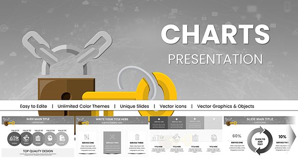
Secure your presentations with our specialized security-themed PowerPoint chart templates, engineered for professionals tackling cybersecurity, physical safety, and compliance challenges. These designs prioritize data visualization, turning abstract threats into clear, actionable insights.
Featuring robust icons like locks and shields, alongside customizable bar graphs and pie charts, they cater to IT specialists, risk analysts, and corporate trainers. Gain an edge with layouts that emphasize vulnerability assessments and mitigation strategies, all while maintaining a sleek, trustworthy appearance.
For audiences demanding precision and protection, these templates streamline complex info into compelling stories. Delve into options that scale from team briefings to executive overviews, and enhance your security communications effortlessly.
Security chart templates are vital for incident reporting, where line charts track breach timelines, or policy overviews using donut charts to show compliance coverage. In training workshops, they illustrate threat landscapes, outperforming plain spreadsheets by adding contextual visuals.
Financial sectors apply them for fraud detection dashboards, with scatter plots correlating anomalies. This focused approach aids quicker threat responses compared to generic PowerPoint charts lacking thematic depth.
During audits, radar charts compare security postures across departments, highlighting gaps with color-coded alerts for immediate action.
While default PowerPoint charts suffice for simple data, ours integrate security motifs and animation triggers for phased reveals, enhancing narrative flow. This reduces cognitive load, with studies showing 25% better comprehension in visualized security data.
Full vector scalability ensures clarity on large screens, and data import from Excel keeps updates seamless.
A tech firm might use a stacked bar chart to depict layered defenses, from firewalls to encryption. In healthcare, bubble charts size risks by impact and likelihood, guiding resource allocation.
These real applications underscore the templates` role in proactive security.
Executive summaries with animated growth charts of threat trends command attention, backing strategic investments with evidence.
These practices ensure charts inform and inspire confidence.
Fortify your insights with precision. Check out our security PowerPoint chart templates and integrate them into your workflow today.
Protect and persuade - begin charting your secure future now.
Copyright © 2009-2026 ImagineLayout All rights reserved.