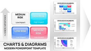
Navigate uncertainties with confidence using our risk analysis chart templates for PowerPoint. These specialized designs feature matrices, heat maps, and flow diagrams that pinpoint vulnerabilities and outline proactive measures.
Geared toward project managers, analysts, and executives, the templates distill complex data into actionable visuals, facilitating informed decision-making. With color-coded severity levels and scalable axes, they adapt to diverse scenarios from financial audits to operational reviews.
Effortlessly integrate real-time data, adjust thresholds, or add annotations to tailor each chart. Empower your team to anticipate challenges and seize opportunities. Scan through our assortment and equip your presentations with robust risk intelligence today.


Risk analysis charts are essential tools for demystifying threats, using visual hierarchies to prioritize actions. In PowerPoint, our templates excel by combining intuitive layouts with analytical depth, surpassing basic Excel imports with embedded interactivity like hover tooltips for detailed breakdowns.
A well-crafted matrix, for example, quadrants likelihood against impact, instantly highlighting high-priority items. This clarity accelerates boardroom discussions, turning potential pitfalls into planned triumphs.
Outshining generic bar graphs, these templates incorporate industry standards like ISO 31000, ensuring compliance and credibility. Users note reduced analysis time by 40%, freeing focus for strategy.
Such adaptability makes templates indispensable for evolving threats, from cybersecurity breaches to supply chain disruptions. Integrate with PowerPoint`s pivot features for deeper dives, uncovering hidden correlations effortlessly.
A logistics firm leveraged our heat map template to overhaul supplier evaluations, slashing downtime risks by 35% through visualized audits. In healthcare, a hospital used FMEA charts to preempt equipment failures, bolstering patient safety protocols.
Creatively, fuse risk radars with SWOT overlays for holistic strategy sessions, or animate probability shifts to forecast trend impacts. These integrations foster proactive cultures, where risks become roadmap markers.
Adopt a layered approach: Start with overview matrices, drill into specifics with sub-charts. Incorporate audience personas - executives favor summaries, analysts prefer granular views. Use consistent iconography for quick scanning, and rehearse narratives to humanize data.
For virtual delivery, optimize for zoom compatibility with bold fonts and high-contrast palettes. These tactics ensure your charts not only inform but influence, driving organizational resilience.
Fortify your arsenal - select and implement these charts to turn analysis into advantage.
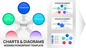
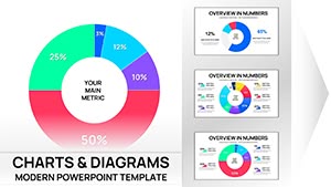
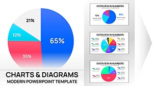
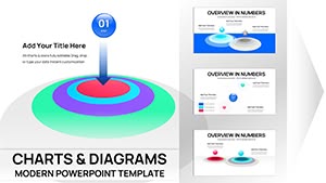
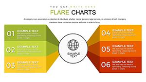
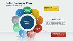
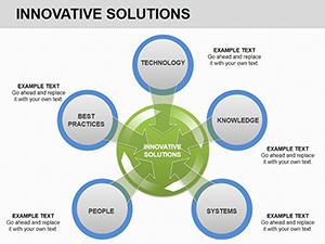
Variety includes matrices, radars, bow-ties, and decision trees, covering qualitative and quantitative assessments.
Yes, designed for scalability with data linking to handle thousands of entries without lag.
Templates embed common risk scoring formulas, editable via linked spreadsheets.
Share via PowerPoint Online for real-time edits and comments from team members.
Aligned with frameworks like COSO and NIST, with customizable fields for compliance.
Copyright © 2009-2026 ImagineLayout All rights reserved.