Report Keynote Charts
Elevate your presentations with our extensive collection of Keynote chart templates designed for professionals and educators alike.
Visualize complex data with ease and make your slides stand out with modern, editable designs.
-
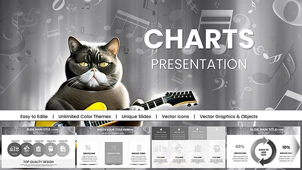
Music Charts Keynote Template: Harmonize Your Data Story
ID: #KC01035
-
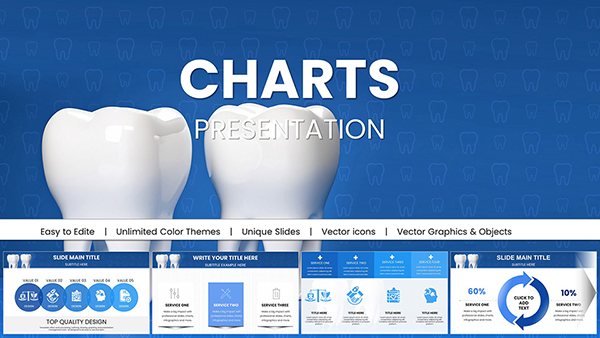
Dental Charts Keynote Template: Illuminate Oral Health Insights
ID: #KC01034
-

Professional Dental Implant Charts Keynote Template
ID: #KC01025
-
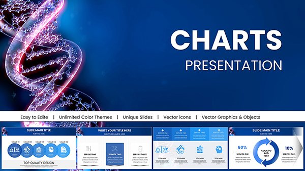
Medicine DNA Genome Keynote Charts: Empower Genomic Narratives
ID: #KC01016
-
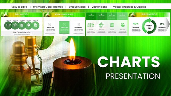
Spa Procedures Keynote Charts: Revitalize Your Wellness Talks
ID: #KC01015
-
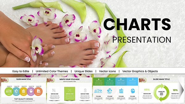
Spa Treatments Keynote Charts for Spa Presentation
ID: #KC01011
-
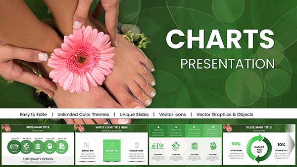
SPA Foot Charts for Keynote Presentation
ID: #KC01010
-
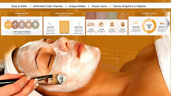
DIY Face Mask Spa Charts for Keynote: Beauty & Wellness Mastery
ID: #KC01005
-
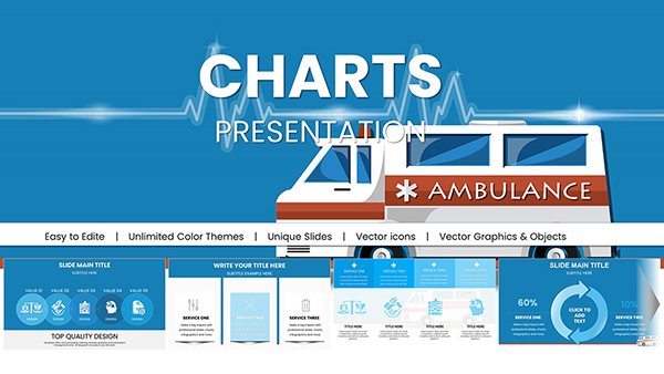
Design Ambulance Keynote Charts Template: Revolutionize Your Medical Visuals
ID: #KC00975
-

Personal Protective Equipment PPE Keynote Charts: Illustrate Safety Effectively
ID: #KC00888
-
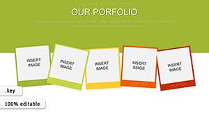
Our Portfolio Keynote Charts
ID: #KC00886
-

Drive Awareness with Preventing Sexual Violence Keynote Template
ID: #KC00879
-

Empower Safety Communications with PPE Keynote Charts Template
ID: #KC00878
-
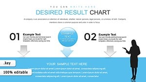
Desired Result Keynote Charts for Marketing Research
ID: #KC00867
-
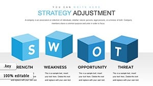
Editable Strategy Adjustment Keynote Charts - 28 Slides
ID: #KC00866
-
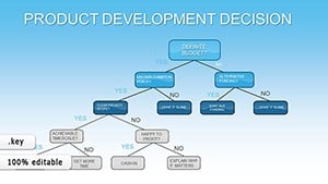
Product Development Decision Keynote Charts: Branch Out Ideas with Tree Visuals
ID: #KC00836
-
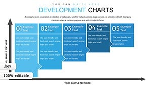
Development Keynote Charts Template: Empower Your Presentations with Dynamic Growth Visuals
ID: #KC00781
-
Keynote Process Charts - Fully Editable | ImagineLayout
ID: #KC00716
-
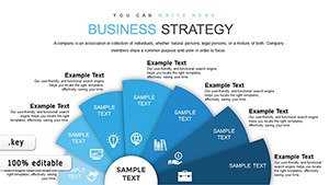
Business Strategy Keynote Charts - Editable Keynote | ImagineLayout
ID: #KC00698
-
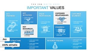
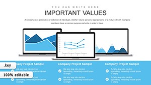
Business Model Canvas Keynote - Fully Editable | ImagineLayout
ID: #KC00612
-

Logic of Operational Analysis Keynote Charts
ID: #KC00603
-

Business Development Strategies Keynote Charts: Navigate Growth with Visual Precision
ID: #KC00587
-

Master Project Communication with Project Manager Keynote Charts Template
ID: #KC00579
-

Business Strategy Development Keynote Charts
ID: #KC00577
Why Choose Keynote Chart Templates
Our templates transform raw data into compelling visuals that engage audiences and simplify decision-making.
- Business reports and analytics presentations
- Educational lectures and academic projects
- Marketing performance dashboards
Benefits Compared to Default Charts
Unlike standard charts, these templates offer professional layouts, color schemes, and animations for enhanced clarity and impact.
Creative Tips and Best Practices
- Highlight trends with color coding
- Animate chart segments for storytelling
- Combine charts with icons for context
Start improving your Keynote presentations today with ready-to-use templates that save time and impress audiences.
Frequently Asked Questions
Can I customize the chart colors and fonts?
Yes, all templates are fully editable, allowing you to match your branding and presentation style.
Are animations supported in all Keynote versions?
Most modern Keynote versions support animations, but check compatibility for older editions.
Can these templates be used for educational purposes?
Absolutely, they are ideal for teaching, training, and academic presentations.