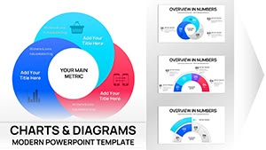
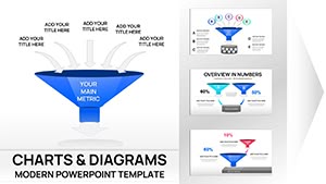
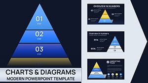
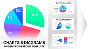
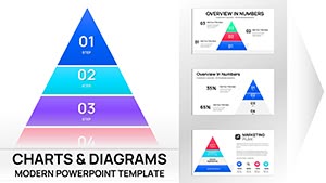
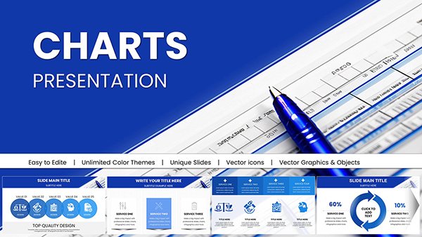
Every presentation has a unique goal, and the right chart can make your message unforgettable. Our diverse collection of over 100 chart templates for Keynote covers virtually every purpose imaginable.
From data-heavy business reports to creative nonprofit campaigns, you`ll find clean, modern designs that adapt to your needs.
Fully editable, animated, and professionally crafted, these templates help you communicate clearly and confidently, no matter the context.
Find the perfect chart for your next presentation today.
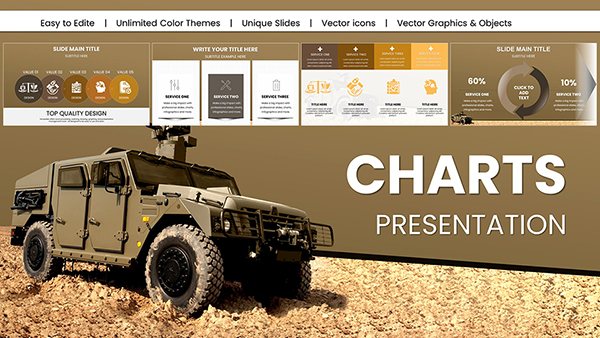
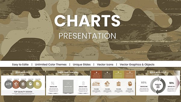
Military Vehicle Keynote Charts Presentation: Elevate Your Defense Strategies
ID: #KC01008
$20.00
(1173)
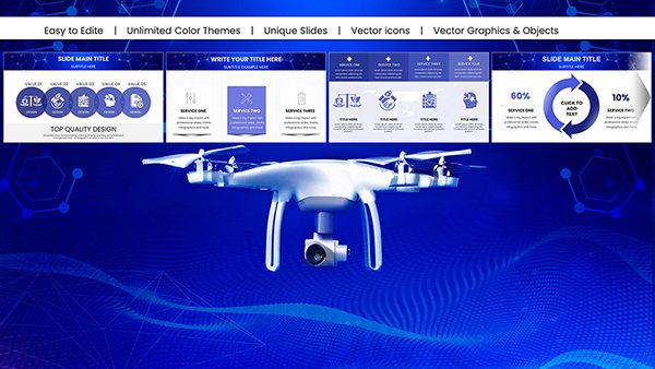
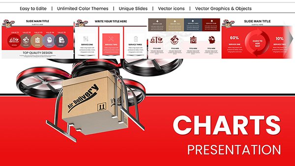
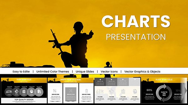
Military Technology Drones Keynote Charts for Presentation
ID: #KC00997
$18.00
(520)
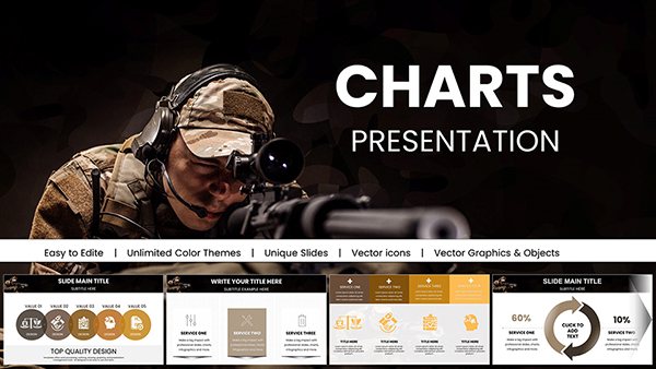
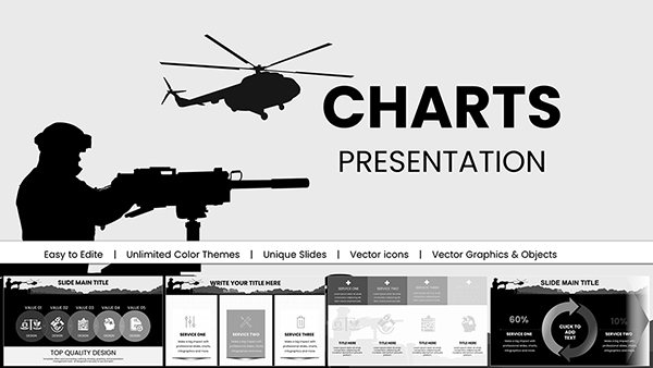
Armed Forces Keynote Charts for Military Presentation
ID: #KC00995
$18.00
(444)
Military Pay Keynote Charts Template
ID: #KC00994
$18.00
(966)
Armed Forces PowerPoint Charts for Military Presentation
ID: #KC00993
$16.00
(1062)
Army Pay Keynote Charts for Military Presentation
ID: #KC00992
$18.00
(605)
Business Correspondence Keynote Charts Template
ID: #KC00957
$20.00
(466)
Professional Business Report Keynote Charts
ID: #KC00938
$25.00
(532)
Sustainable Development Keynote Charts: Empower Your Eco-Presentations
ID: #KC00937
$25.00
(221)
Professional Development Keynote Charts: Elevate Your Growth Strategies
ID: #KC00936
$20.00
(700)
Technical Analysis Keynote Charts: Charting Paths to Profit
ID: #KC00924
$22.00
(667)
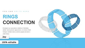
Rings Connection Keynote Charts for Cycle Processes
ID: #KC00868
$16.00
(1066)
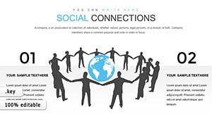
Social Connections and Happiness: Keynote Template for Deeper Insights
ID: #KC00844
$14.00
(354)
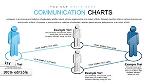
Communication Keynote Charts Template
ID: #KC00826
$16.00
(535)
IT Processes Charts - Editable Keynote | ImagineLayout
ID: #KC00738
$19.00
Charts Designed for Real Purposes
We`ve organized our templates by common presentation goals so you can quickly find what you need. Each design prioritizes clarity, impact, and ease of use.
Why Custom Templates Beat Built-In Options
Purpose-specific layouts that fit your content perfectly