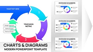
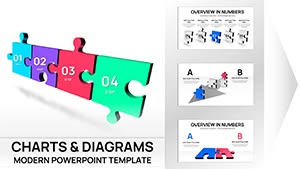
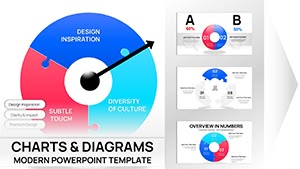
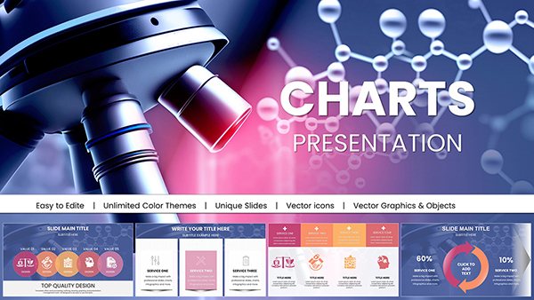
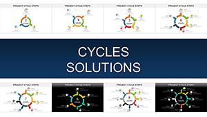
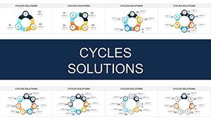
Effective project risk communication hinges on visuals that cut through the noise. Our project risk PowerPoint charts deliver exactly that: sophisticated, ready-to-use designs that help managers and teams articulate threats, probabilities, and responses with precision and poise.
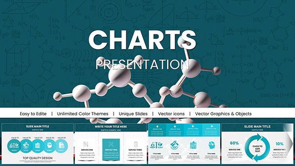
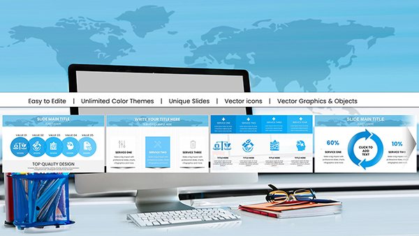
From bow-tie analysis diagrams to Monte Carlo simulation graphs, these templates are optimized for PowerPoint`s robust features, including smart art enhancements and data linking. Perfect for consulting firms, engineering teams, and startups, they enable you to forecast outcomes, prioritize actions, and align on contingencies without starting from scratch.
Benefits abound - reduced preparation time, heightened audience retention, and a competitive edge in proposal pitches. Tailored for clarity in high-stakes environments, these charts turn abstract risks into tangible roadmaps. Peruse our assortment and select templates that align with your project`s scale and sector. Begin enhancing your slides now and lead with confidence.
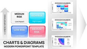

Generic charts in PowerPoint can obscure rather than illuminate risks, leading to misinformed decisions. Our specialized PowerPoint project risk templates counter this with layered hierarchies, conditional formatting, and export-ready formats that maintain fidelity across devices. They outperform defaults by integrating risk scoring formulas directly into slides, automating updates as data evolves.
Imagine an engineering project grappling with regulatory hurdles; our FMEA (Failure Mode and Effects Analysis) chart allows drag-and-drop severity ratings, instantly recalculating totals for at-a-glance insights. This interactivity fosters collaborative editing in shared sessions, a boon for remote teams.
Beyond visualization, these tools support narrative building - embed notes within chart elements for deeper dives during Q&A, enhancing your storytelling prowess.
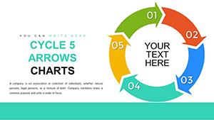
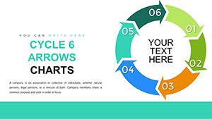
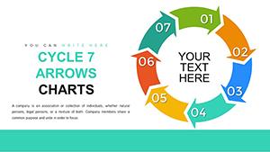
Begin with audience analysis: for executives, opt for summary dashboards; for technicians, detailed breakdowns. Leverage PowerPoint`s morph transition for smooth risk progression animations, unavailable in basic setups. Best practice: cap data points at seven per chart to preserve focus, using icons for instant recognition.
Versus competitors, our templates boast 50% faster load times due to optimized vector graphics, ideal for large decks. Users in manufacturing note improved compliance reporting, with visuals that satisfy audit standards effortlessly.
Transform potential pitfalls into strengths - download today and refine your approach.
Free alternatives often skimp on scalability, pixelating at high resolutions. Ours scale infinitely, with theme-consistent palettes that reinforce branding. Unique perks include built-in sensitivity analysis sliders, letting you simulate "what-if" scenarios on the fly.
In academia, professors adapt them for case studies, praising the modular structure. Corporates see 30% better risk buy-in from teams, thanks to empathetic design that humanizes data. Accessibility shines with screen-reader friendly labels and color-blind modes.
Pair with our mitigation strategy slides for end-to-end coverage. Your presentations deserve this edge.
Armed with these resources, tackle risks headfirst. Explore more to complete your toolkit.
Copyright © 2009-2026 ImagineLayout All rights reserved.