Bring your product market expansion ideas to life with specialized PowerPoint charts for product market expansion. Ideal for analysts, consultants, and C-suite executives, this collection focuses on high-impact visuals that turn raw data into strategic insights. Whether charting revenue streams or plotting entry barriers, these charts ensure your presentations cut through the noise.
Crafted with precision, each chart template incorporates best-in-class design principles - clean lines, intuitive legends, and scalable axes - to handle everything from quarterly forecasts to multi-year horizons. Say goodbye to cluttered spreadsheets; hello to polished graphics that resonate in boardrooms and virtual calls alike.
Targeted at professionals navigating growth phases, these resources accelerate decision-making by highlighting trends and opportunities at a glance. Browse the category to discover charts that align perfectly with your expansion objectives and start visualizing victory today.


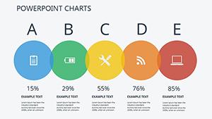
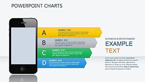
Effective market expansion hinges on clear data visualization, and our PowerPoint charts for product market expansion deliver just that. Unlike basic bar graphs, these advanced designs include bubble charts for opportunity sizing, line graphs for trend tracking, and pie diagrams for share allocation - each optimized for strategic depth.
Business development teams appreciate the ease of updating datasets, while executives value the executive summaries embedded in every layout. This fusion of functionality and aesthetics positions your charts as indispensable tools for persuasive pitches.
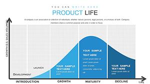
Picture a logistics firm expanding routes: our combo chart template merges area plots for volume growth with scatter points for cost efficiencies, revealing optimal paths in one view. This not only saves time but amplifies the clarity of your recommendations.
Generic charts often lack context, resulting in misinterpretations during reviews. Our templates counter this with pre-labeled axes for market variables and color-coded risk indicators, ensuring accuracy and engagement. They`re also responsive, adapting to light or dark modes without losing fidelity.
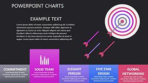
Maximize impact by aligning chart types to your story - line for progression, bar for comparisons. A pro tip: integrate subtle animations to reveal data layers progressively, maintaining audience focus. These practices, baked into our designs, help you craft narratives that drive consensus.
Standout features include drag-and-drop data links and theme consistency, making bulk updates a breeze for large decks.
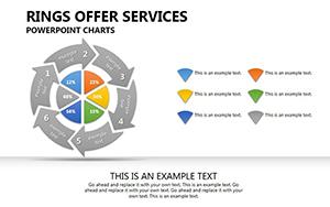
For a beverage brand entering Europe, deploy our donut chart for flavor portfolio distribution, overlaid with growth rings for phased introductions. Creatively, add trend lines from external benchmarks to benchmark your projections, fostering credibility.
In education settings, adapt these for case studies: a university`s program expansion visualized via stacked bars for enrollment forecasts by region. Tip: Use contrasting hues for positive vs. challenge metrics to evoke emotional responses.
Enhance with hyperlinks to source data or embedded formulas for real-time recalculations. This turns static charts into interactive dashboards, ideal for collaborative planning sessions.
CTA: Illuminate your data story - download these charts and chart your course to expansion.
These insights clarify how to integrate our charts into your workflow. Peruse the category for immediate downloads.
CTA: Visualize your breakthrough - grab a chart template and propel your strategy forward.
Copyright © 2009-2026 ImagineLayout All rights reserved.