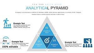
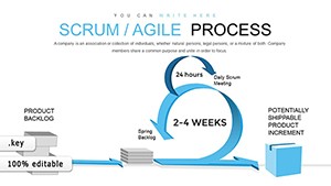
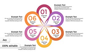
Simplify intricate operations with our process analysis Keynote charts, engineered for analysts, managers, and consultants. These charts distill workflows into clear, visual narratives, using flow diagrams, cycle models, and step-by-step breakdowns to illuminate efficiencies and bottlenecks.
Geared toward operations teams, quality assurance specialists, and strategy planners, they offer scalable designs that adapt to any project scale. Gain advantages like color-coded phases for quick scans and interactive nodes for deeper dives during presentations.
Customization is a breeze - input your metrics, tweak arrows for dependencies, and align with corporate aesthetics. Ideal for audits, training, or board updates, these charts turn data into decisions. Navigate the category to analyze and adopt the right tool for your flow.
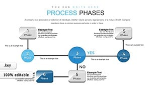
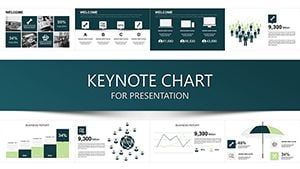
Process analysis thrives on visibility, and our Keynote charts deliver it with precision engineering. They outpace vague sketches by employing standardized symbols - ovals for starts, diamonds for decisions - ensuring universal comprehension. Basic charts lack depth; ours layer metrics overlays for performance tracking.
Operations leads map supply chains, spotting delays in real-time visuals. Consultants dissect client procedures, recommending tweaks via annotated paths. Trainers simulate scenarios, walking learners through optimized routes.
Envision a manufacturing review: Charts trace assembly lines, quantifying waste reductions. Software devs flowchart user journeys, refining UX with branch analyses. HR streamlines onboarding, charting milestones from hire to productivity.
Superior to spreadsheets, they visualize holistically, cutting miscommunication by half. Exportable to reports, they maintain fidelity across formats.
Enhance with zoomable sections for granular views. Fuse with simulations for predictive what-ifs, forecasting improvements.
Leverage for lean initiatives, diagramming value streams to eliminate non-essentials. Auditors trace compliance paths, flagging risks proactively. Innovators prototype R&D pipelines, iterating designs fluidly.
Streamline your strategy? Delve into process analysis charts and chart your course now. Immediate access accelerates analysis.
Further inquiries? We`re here to process them swiftly.
Copyright © 2009-2026 ImagineLayout All rights reserved.