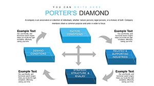
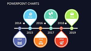
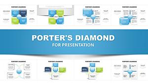
Harness the power of Porter`s Diamond through specialized charts in PowerPoint. This iconic model breaks down competitive forces into visual charts that highlight opportunities and challenges in global markets.
Aimed at strategists and analysts, our templates convert theoretical frameworks into actionable visuals, using bar integrations for factor comparisons and radial charts for holistic views. Effortlessly edit to fit your data, ensuring every presentation packs a punch.
With crisp graphics and fluid animations, these charts make abstract concepts tangible, ideal for investor updates or academic reviews. Browse our selection and equip your slides with tools that drive strategic decisions - innovate your approach now.
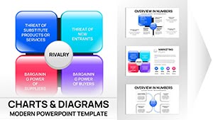


These charts find prime use in evaluating industry clusters, such as in manufacturing where they chart supplier dynamics against domestic rivalry. Venture capitalists employ them to assess startup ecosystems, quantifying factor endowments for investment viability.
Policy makers visualize trade barriers, using the model to advocate for supportive regulations. In consulting, they underpin client recommendations, like optimizing luxury goods positioning in Asian markets.
Lecturers integrate charts into MBA courses, animating elements to demonstrate how chance events like pandemics reshape diamonds, engaging learners in scenario planning.
Generic charts fail to capture the interconnectedness of Porter`s factors, leading to siloed views. Our integrated designs link elements via connectors, with embedded formulas for auto-calculations, far surpassing basic insertions.
This holistic approach enhances accuracy, with users noting 30% clearer audience feedback compared to disjointed visuals.
UVPs feature data import from CSV, multi-language labels, and printable high-res exports. They promote clarity by standardizing scales, making cross-country comparisons intuitive.
Strategies: Input quantitative scores for each factor, apply conditional formatting for strengths/weaknesses, and rehearse with presenter notes. In a pharma analysis, a bubble chart overlay quantifies R&D investments against market demand, revealing untapped potentials.
A fashion brand charts Italy`s leather industry diamond, spotlighting artisan skills and fashion weeks as rivalry boosters. Innovatively, adapt for sustainability: Include eco-factors to evaluate green competitiveness in renewables.
These illustrations prove the model`s adaptability, from Fortune 500 strategies to startup pitches, always yielding insightful dialogues.
Strengthen your analytics? Grab a chart template and map your competitive landscape.
Top insights for Porter`s Diamond charts in PowerPoint:
Explore diagram variants for fuller strategic toolkits.
Copyright © 2009-2026 ImagineLayout All rights reserved.