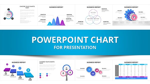
Transform raw planning data into compelling stories with our PowerPoint chart templates, crafted for those who demand precision in every presentation. Ideal for analysts, executives, and planners tracking metrics like budgets, timelines, and performance indicators, these templates turn numbers into narratives that drive decisions.
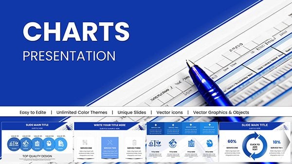
Our collection spans essential chart types: dynamic bar charts for comparisons, line graphs for trends over time, and scatter plots for correlation insights. Each one features minimalist designs that highlight data without clutter, ensuring your audience focuses on insights rather than distractions.
Benefits abound - save design time, maintain consistency across decks, and impress with responsive layouts that adapt to any slide size. Whether forecasting sales pipelines or monitoring project KPIs, these tools empower you to communicate complex information with ease and elegance.
Step up your planning game: Explore the variety and select templates that fit your data story perfectly.
In planning scenarios where data accuracy meets visual appeal, our PowerPoint chart templates deliver unmatched value. They go beyond basic inserts by embedding advanced formatting options, like gradient fills and 3D effects, that enhance readability without sacrificing professionalism. Compared to ad-hoc creations, these pre-built charts reduce errors and ensure uniform styling, vital for multi-slide planning decks.
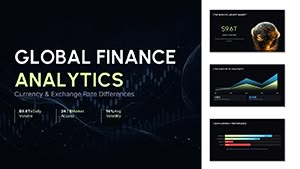
Envision a waterfall chart dissecting quarterly expenses: inflows in green, outflows in red, netting to your bottom line. This not only clarifies financial planning but invites questions that deepen strategic talks. Professionals using such visuals often see faster buy-in from teams, as charts make abstract figures tangible.
These scenarios showcase how charts fit diverse planning contexts, from agile sprints to annual reviews, always prioritizing actionable intelligence.
Default PowerPoint charts can appear dated, with inflexible legends and axes that complicate updates. Our templates counter this with modular designs - swap datasets via simple clicks, and watch labels, scales, and colors synchronize automatically. This efficiency is a game-changer for iterative planning, where data evolves rapidly.
Moreover, built-in accessibility features like descriptive tooltips and color-blind-friendly palettes set them apart, fostering inclusive presentations that reach every stakeholder.
Adopting these habits elevates charts from mere graphics to persuasive tools, amplifying your planning influence.
Consider Alex, a logistics planner, who employed our area chart to depict inventory levels over seasons. By stacking product categories, he revealed surplus patterns, optimizing storage and cutting costs by 15%. This real impact underscores the templates` role in foresight.
In creative agencies, heat maps visualize client engagement by project phase, using color intensity to flag hot spots. Customize with brand hues, and it becomes a signature element in pitch decks.
For sustainability planning, sunburst charts dissect carbon footprints, with nested rings for departmental contributions - ideal for ESG reports that demand transparency.
Enhancement Idea: Layer subtle shadows for depth, making flat data pop in high-stakes meetings.
Don`t let data overwhelm - grab a chart template now and craft visuals that clarify and captivate.
What chart is ideal for trend analysis in planning? Line charts excel at showing progressions over time, like quarterly goals.
Do templates support real-time data linking? Yes, connect to Excel for automatic refreshes during live sessions.
Are animations included for chart reveals? Built-in options allow phased data entry for dramatic effect.
How to ensure charts are mobile-friendly? Use responsive scaling to maintain legibility on all devices.
Can I export charts for reports? Easily convert to high-res images or PDFs for broader use.
What`s the difference between pie and donut charts? Donuts save space and work better for few slices, enhancing planning overviews.
Copyright © 2009-2026 ImagineLayout All rights reserved.