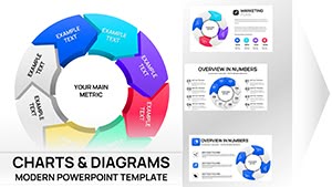
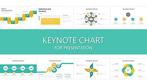
Harness the power of visual storytelling with our strategic plan Keynote chart templates, tailored for leaders crafting roadmaps in dynamic business landscapes. These meticulously designed slides feature interlocking timelines, cascading Gantt charts, and radial goal maps that transform abstract strategies into tangible, trackable visuals.
Perfect for project managers, consultants, and C-suite executives, they facilitate clearer communication during strategy sessions, ensuring every stakeholder grasps objectives, dependencies, and deadlines. With drag-and-drop simplicity and native Keynote animations, customization feels intuitive, allowing focus on insights rather than formatting.
Browse through variations suited to agile sprints or long-term visions, from corporate expansions to product launches. Ignite your planning process now and chart a course to success.


Keynote`s elegance pairs perfectly with planning needs, where charts bridge vision and execution. Our templates excel in boardroom strategizing, where bubble charts cluster initiatives by priority and impact, or in marketing teams plotting campaign funnels with conversion pyramids.
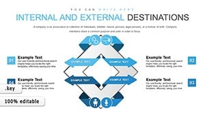
Non-profits utilize swimlane diagrams to delineate volunteer roles in event planning, fostering collaboration. In R&D, dependency wheels visualize innovation pipelines, highlighting bottlenecks early.
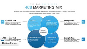
Strategy consultants deploy these for client workshops, using matrix quadrants to evaluate SWOT elements dynamically. Educational planners in universities map curriculum developments with flowchart integrations, streamlining accreditation processes.
Default Keynote charts lack thematic cohesion and scalability, often resulting in cluttered, uninspiring visuals. Our plan-focused templates introduce layered hierarchies, color-coded legends, and exportable SVGs for reports, elevating professionalism while saving hours on redesigns.
Built-in responsiveness ensures charts reflow on varied devices, crucial for remote planning huddles. Thematic accents like compass icons for direction add narrative depth, absent in generic tools, enhancing engagement and comprehension.
Populate data via linked tables, apply filters for scenario what-ifs, and trigger builds to reveal insights sequentially - all without leaving Keynote`s interface.
Begin with objective clarity: define success metrics before diagramming. Layer complexity gradually, starting with overviews and drilling into details. Solicit cross-team input during builds to ensure buy-in, and iterate based on feedback for agility.
For hybrid meetings, embed hyperlinks to detailed docs within charts, creating interactive ecosystems. Regularly audit visuals for accuracy, updating legends as plans evolve.
Shape your future with precision - download a template and commence your strategic visualization journey.
A tech firm accelerated product rollouts using our PERT network charts, reducing delays by 30% through visible interdependencies. In healthcare, administrators mapped outbreak response plans with heatmap overlays, aiding rapid resource shifts.
Event planners customized cascade diagrams for multi-venue festivals, sequencing logistics flawlessly. These examples illustrate how targeted charts catalyze execution in varied arenas.
Innovate with AR integrations, where Keynote exports link to 3D models of facilities, or AI-assisted auto-adjustments for dynamic forecasting.
Timelines and Gantt charts excel for multi-year horizons, with zoomable scales for detail.
Yes, optimized for thousands of entries with filtering and aggregation tools.
Fully - adjust timing, easing, and sequences to match your pace.
Export as PDF, PNG, or SVG directly from Keynote for versatile use.
Integrate with iCloud for real-time team modifications.
Empower your plans with visuals that resonate - grab your ideal chart template and strategize boldly.
Copyright © 2009-2026 ImagineLayout All rights reserved.