Empower your strategic sessions with planning method chart templates crafted for Keynote. These versatile visuals encompass methodologies like Agile sprints, SWOT matrices, and phased roadmaps, helping teams align on goals and timelines. Designed for managers, consultants, and educators, they simplify complex planning into actionable slides.
Leveraging Keynote`s strengths, templates include draggable milestones, color-coded phases, and collaborative notes. From startup pivots to curriculum outlines, they provide frameworks that evolve with your input.
Transform vague ideas into structured paths with intuitive edits and export options. This category offers tools for every horizon - short-term tactics to long-range visions. Chart your course confidently; explore and implement these planning essentials now.
Planning method chart templates in Keynote distill methodologies into visual blueprints, from critical path analysis to mind-mapping clusters. They outpace handwritten notes by offering zoomable details and version histories, ensuring plans remain dynamic.
Tailored for organizational leaders and project coordinators, these facilitate brainstorming to execution. Consultants deploy for client audits, teachers for unit planners.
Product teams visualize sprints with burndown integrations; HR maps onboarding flows. Non-profits outline grant cycles with milestone gates.
Default charts lack method-specific icons; these embed PDCA cycles or RACI matrices, enhancing adoption. Visual plans correlate with 35% faster project completions per studies.
Input data via tables for auto-generation, using conditional formatting for at-risk items. Animate phases to reveal dependencies sequentially. Collaborate via shared links with comment bubbles.
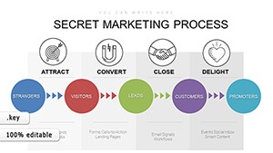
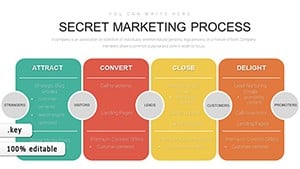
Example: A launch plan cascades from ideation to metrics, with swimlanes for roles. Hack: Color-code by urgency for quick scans.
Plot your progress - download now and methodize your moves.
Combine Kanban with Gantt for agile-traditional hybrids, using overlay layers. For remote teams, add video call placeholders in timeline nodes.
Limit nodes to 20 per view to prevent overload; use hyperlinks for deep dives.
Adaptive designs like these drive cross-functional alignment.
Build in review gates with checklist overlays. Export to calendars for task syncing. Iterate based on post-mortem slides embedded at ends.
For scalability, template master slides for recurring projects.
Agile, Waterfall, Lean, and hybrids like Design Thinking.
Copy from Excel; templates parse dates and durations automatically.
iCloud sharing with real-time edits and version control.
Yes, export as images or PDFs for reports.
5-8, including Gantt, PERT, and flowchart variants.
Strategize with precision. Explore options and tailor your plan.
Copyright © 2009-2026 ImagineLayout All rights reserved.