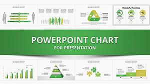
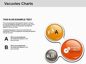
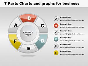
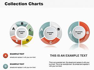
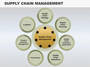
Unlock the power of visual data representation with our collection of pie chart templates tailored for PowerPoint. These designs transform complex statistics into engaging, easy-to-understand visuals that captivate your audience, whether you`re preparing a corporate report, educational lecture, or marketing pitch.
Perfect for analysts, educators, and business professionals, these templates feature clean lines, vibrant colors, and fully editable elements. Adjust segments, add labels, and integrate your data seamlessly to highlight key insights like market shares, budget allocations, or survey results. Say goodbye to bland spreadsheets and hello to slides that communicate your message with precision and style.
Explore our curated selection today and find the perfect pie chart layout to make your presentations stand out. With instant download access, you can start customizing right away and deliver compelling narratives that drive decisions.
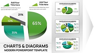
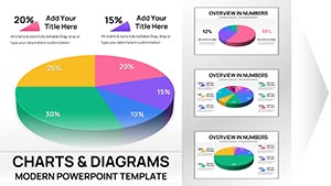
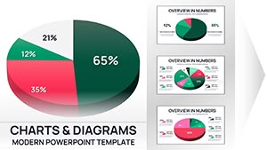
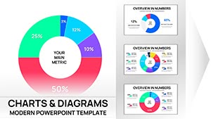
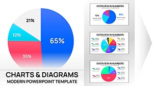
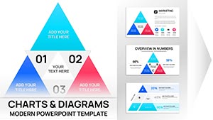

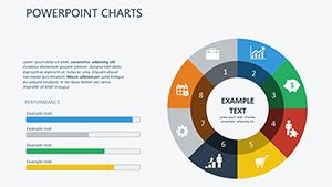

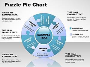
Pie charts remain a staple in data visualization because they excel at showing proportions and parts of a whole in an intuitive format. Unlike bar graphs that can overwhelm with length, pie charts offer a compact, circular view that`s immediately digestible. Our templates enhance this by incorporating modern aesthetics - think subtle gradients, 3D effects for depth, and responsive animations that reveal segments one by one during your presentation.
For business use cases, imagine slicing through sales data to reveal regional contributions or breaking down project expenses to justify budgets. In education, teachers use them to illustrate historical timelines or scientific compositions, making abstract concepts tangible for students. Creatives might employ pie charts in portfolios to showcase skill distributions, adding a professional polish to freelance pitches.
Standard PowerPoint pie charts are functional but often lack flair - they`re plain circles with basic fills that blend into the background. Our templates stand out with pre-built themes: minimalist for executive summaries, colorful for team meetings, or thematic (like eco-friendly greens for sustainability reports). Plus, they`re vector-based, ensuring crisp scaling without pixelation, and include built-in data connectors for effortless updates.
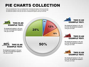
To maximize impact, limit slices to 5-7 for clarity - crowded pies confuse viewers. Use contrasting colors for adjacent segments and include percentages or values for precision. Start with a whole-pie overview, then explode a key slice to zoom in on details. Test on different screens to ensure readability, and pair with narrative: "As you can see, 40% of our revenue stems from digital channels, underscoring our pivot strategy."
Pro tip: Animate entry effects sparingly to guide the eye, avoiding distractions. For interactive touch, hyperlink slices to detailed sub-slides, turning static charts into dynamic stories.
In healthcare, pie charts map patient demographics or treatment outcomes, fostering informed discussions. Finance pros dissect investment portfolios, while nonprofits visualize donor breakdowns to rally support. Even in gaming, they chart player engagement metrics, blending fun with function.
One standout example: A marketing firm used our gradient pie template to depict campaign ROI, resulting in a 25% increase in client approvals - proof that thoughtful design drives results.
Ready to diversify your visuals? Browse complementary bar and line chart templates to build comprehensive dashboards. Download your favorites now and transform every slide into a conversation starter.
Our templates are optimized for PowerPoint (.pptx) and fully editable in Microsoft Office or compatible software like Google Slides.
Absolutely - designs are royalty-free for personal and professional use, with no attribution required.
Simply select the chart, edit the linked Excel sheet, or input values directly; changes update instantly.
Yes, templates scale responsively for presentation on tablets or projectors, maintaining visual integrity.
Each element is color-coded for quick swaps - use the theme editor to align with your palette in seconds.
Copyright © 2009-2026 ImagineLayout All rights reserved.