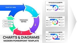
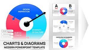
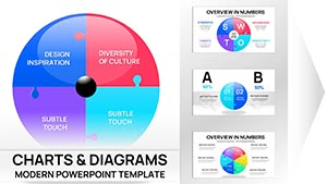
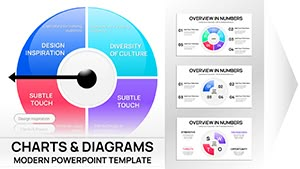
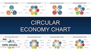
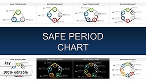
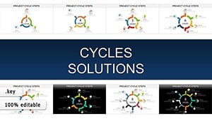
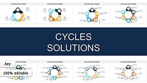
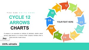
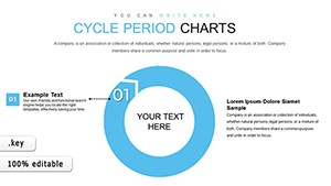
Pie process Keynote charts offer a sophisticated way to illustrate workflows, dividing circles into meaningful arcs that trace paths like design iterations or event planning. Targeted at designers, speakers, and coordinators, they add polish to any deck.
With smooth scaling, thematic fills, and effortless grouping, these charts integrate natively in Keynote. Animate them to unfold like a story, revealing connections that linear lists obscure.
More than tools, they`re enhancers of understanding and elegance.
Explore pie process Keynote charts and circle back to compelling content.
World Economic Situation Keynote Charts Template: Decode Crises for Resilient Strategies
ID: #KC00591
$24.00
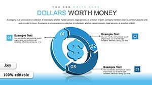
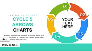
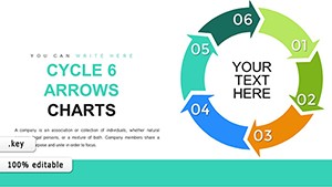
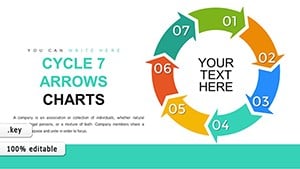
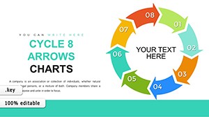
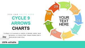
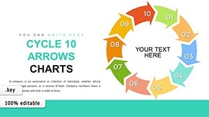
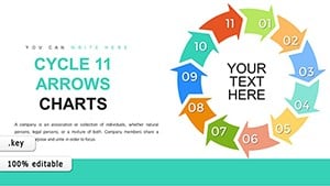
The Elegance of Pie Process Keynote Charts in Action
Pie process Keynote charts distinguish themselves with fluid, vector-based segments that adapt fluidly, eclipsing rigid defaults in conveying holistic views - like seasonal marketing campaigns in rotational slices. Picture arcs that glow on cue, syncing with your voice for rhythmic delivery.
For creative agencies, map client onboarding from brief to brief. In workshops, dissect creative blocks with therapeutic pie breakdowns.
Strategic Deployments Across Contexts
Project Roadmaps: Arc out milestones with milestone markers.
Feedback Loops: Circle critiques in collaborative review cycles.
Event Timelines: Segment prep phases for coordinator handoffs.
Advanced over basics, they leverage Keynote`s magic move for seamless evolutions between slides.
Signature Traits and Polish Pointers
Standouts: Infinite scalability and blend modes for overlaid textures. Tip: Mask segments with shapes for custom icons, personalizing to themes like recipe steps.
Amplify via audio integration, timing slice reveals to narration beats.
Revolve around excellence - add a pie process Keynote chart forthwith.
Refinement Routines for Mastery
Harmonize Hues: Select complementary schemes for intuitive progression reading.
Sequence Builds: Layer appearances to build tension and release.
Embed Interactivity: Hyperlink slices to deep-dive builds.
Inspired by TED-level talks, these craft hypnotic, memorable moments.
Imaginative Extensions and Fusions
Fuse with photos for mood boards, where process pies overlay inspirational collages. In personal development, chart habit formations with daily arc trackers.
For virtual events, animate live polls into evolving pies for audience buy-in.
FAQ
Encircling 1,200 words of visionary variance, pie process Keynote charts orbit innovation. Secure yours to spin superior stories.