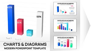
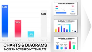
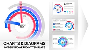
Illuminate your strategic narratives with model chart templates for PowerPoint, blending analytical rigor with visual sophistication. Perfect for planners, data scientists, and leaders decoding patterns and projections.
Charts like decision trees and simulation graphs render models accessible, highlighting variables and outcomes. They transform dense analyses into persuasive stories that influence outcomes.
Powered by PowerPoint`s charting engine, tweaks are straightforward. From risk assessments to growth forecasts, command attention with precision. Survey our range and chart your course.
Model charts in PowerPoint demystify simulations, allowing users to forecast scenarios with graphical elegance. They support what-if analyses, vital for agile planning in volatile markets.
Analysts chart Monte Carlo simulations, while strategists model market shares. The interpretive power turns data into foresight.
Benefits Beyond Standard Charts
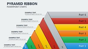
Scenario Branching: Multi-path visuals for alternative futures.
Precision Scaling: Handle large datasets without loss of fidelity.
Interactive Elements: Hover effects for deeper dives.
Finance teams model portfolio risks with sensitivity charts. Product managers visualize user adoption curves. These charts pinpoint levers for optimization.
Tailored Techniques
Axis Customization: Log scales for exponential growth models.
Trend Overlays: Superimpose benchmarks for comparative insights.
Annotation Layers: Callouts for key assumptions.
Validate with sensitivity tests.
Pro Optimization Hacks
Embed formulas for auto-updates, and color-code confidence intervals. Practice reveals for timed emphasis.