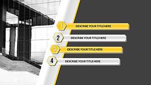
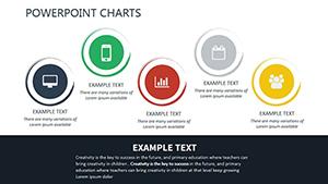
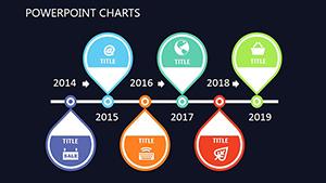
Dive into our curated selection of PowerPoint charts tailored for measurement purposes. These templates empower you to display everything from performance benchmarks to goal progressions with professional finesse. Suited for executives, data enthusiasts, and team leaders, they transform raw numbers into narrative gold.
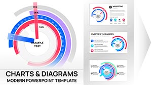
Featuring gauge-style charts for target achievements and line graphs for trend measurements, each design is optimized for PowerPoint`s robust features. Edit effortlessly to fit your dataset, apply themes, and add animations that reveal insights progressively. Say goodbye to bland spreadsheets - hello to visuals that captivate and convince.
Whether tracking quarterly sales or monitoring project timelines, our charts ensure clarity and impact. Browse our collection to discover templates that align with your needs, and begin crafting presentations that stand out. Download your favorites today for immediate use.


PowerPoint`s versatility shines through these charts, which go beyond basics with embedded formulas for auto-updating measurements. Ideal for real-time demos, they surpass free online generators by offering offline reliability and unlimited customizations. Focus on storytelling while the visuals handle the heavy lifting.
In education, scatter plots measure correlation between study hours and scores, making lessons interactive. Versus default charts, ours include shadow effects and gradients for depth, enhancing perceived professionalism.
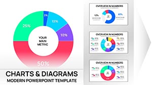
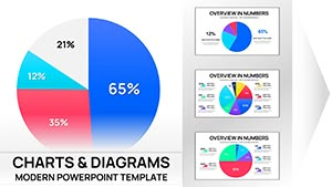
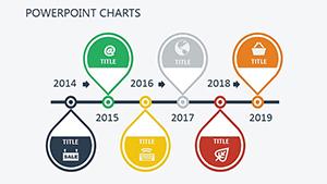
Select chart types wisely: use stacked bars for cumulative measurements to show composition at a glance. Maintain consistency in axis labeling - e.g., monthly increments for time-based data - and limit colors to a palette of four for accessibility. Animate sequentially to build suspense, revealing one metric at a time.
What sets us apart? Layered transparency options for overlaying multiple datasets, impossible in standard templates without plugins. Apply this in sales forecasts by superimposing actuals over projections.
While basic PowerPoint charts require manual scaling, our pre-formatted ones handle logarithmic measurements out-of-the-box, ideal for exponential growth visuals. They also support Excel linking for dynamic updates, streamlining workflows.
Transform your next meeting - grab a template and watch engagement soar.
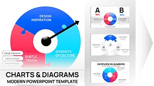
For environmental impact reports, employ bubble charts where size represents carbon measurement scale, position by region. A tech firm used our radar charts to measure feature adoption across user segments, clarifying priorities vividly.
Creative twist: Integrate icons like rulers into bar ends for literal measurement themes in design pitches.
Don`t wait - download now and measure your presentation`s potential.
These charts are your secret weapon for data-driven narratives. Get started and chart a course to success.
Copyright © 2009-2026 ImagineLayout All rights reserved.