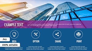
Turn raw metrics into meaningful insights with our specialized Keynote measurement charts. Perfect for anyone tracking performance, progress, or targets - from executives monitoring company KPIs to team leads reviewing project milestones.
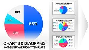
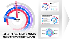
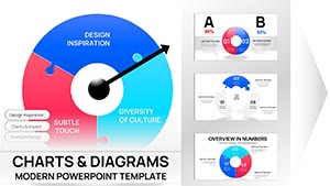
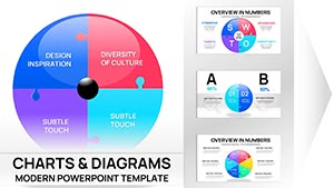
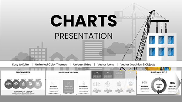
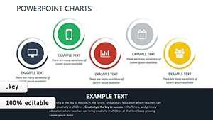
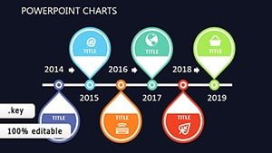
Over 80 carefully designed templates include gauge charts, bullet graphs, thermometer-style progress trackers, scorecard layouts, and sophisticated dashboard combinations - all optimized for clarity and immediate understanding.
Updated for design trends with modern typography, subtle gradients, and smooth reveal animations that guide attention to key measurements.
Effective measurement visualization turns numbers into actionable intelligence. Our templates emphasize target vs. actual comparisons, trend direction, and status indicators that stakeholders can interpret in seconds.
Key Applications
Executive Dashboards
Combine multiple KPIs on single slides with balanced layouts that prevent information overload.
Project Management Reviews
Show task completion rates, milestone progress, and resource utilization with intuitive visual indicators.
Operational & Department Reports
Track production metrics, customer satisfaction scores, or safety indicators with clear gauge and bullet designs.
Design Tips for Measurement Charts
Use red-amber-green coloring consistently for status
Place targets as reference lines or bands
Show both absolute values and percentages when helpful
Keep scales simple and avoid unnecessary gridlines
Elevate your performance reporting - explore our measurement chart collection and download templates that make your metrics shine.
Frequently Asked Questions
Do templates include target/reference lines?
Yes, most measurement charts have built-in target lines, benchmarks, and tolerance bands.
Can I create multi-KPI dashboard slides?
Many templates are designed as complete dashboard layouts with coordinated styling.
Are gauge and speedometer styles available?
Yes, we offer modern, clean versions of gauge charts alongside more contemporary alternatives.
How easy is it to update measurement values?
Data tables are organized and linked to chart elements for fast updates.