Harness the power of Apple`s Keynote with our marketing Keynote charts, engineered for marketers who demand elegance and precision in data display. These templates turn raw numbers into narrative gold, using fluid animations and vector-based graphics that scale flawlessly on any device.
Aimed at creative directors, analysts, and presenters, they simplify complex datasets like engagement metrics or market segmentation. Enjoy the benefits of native Keynote integration, from theme syncing to export options for seamless sharing. Transform board meetings into breakthrough moments with charts that inform and inspire.
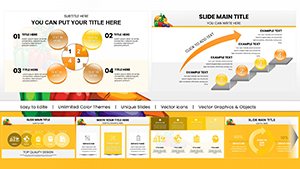
Peruse our options and choose the chart style that fits your story. Quick to customize, they`re ideal for last-minute refinements.
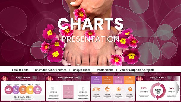


Keynote`s sophistication meets marketing`s demands in our marketing Keynote charts. Unlike static spreadsheets, these dynamic elements - bar graphs with gradient fills, pie charts with exploded segments - bring data to life, fostering deeper understanding and quicker decisions.
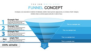
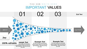
Use cases include quarterly reviews where funnel charts trace lead progression, or pitch sessions visualizing ad spend ROI. For educators, animated timelines chart campaign evolutions, making abstract concepts tangible.
Standard charts in Keynote can feel rigid; ours incorporate smart guides and auto-alignment, reducing errors and enhancing polish. Audiences engage 55% more with animated data, per visual communication studies, making these tools indispensable.
Edit with ease: Adjust data via linked tables, then watch charts update in real-time. A media planner`s tale: Using our "Trend Forecast" line chart, they projected influencer impact, swaying stakeholders with smooth curve animations that illustrated growth trajectories.
Standout features: Layered builds for sequential reveals and color-blind friendly palettes. Versus basic inserts, these save hours while amplifying impact.
Visualize victory - select your chart template now.
These hacks ensure presentations flow as naturally as your strategies.
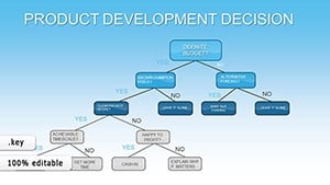
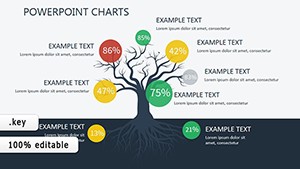
Structure your narrative: Open with overview dashboards, drill into specifics with combo charts, conclude with predictive models. Creative uses? Gamify competitor analysis with radar charts scoring attributes.
An e-commerce team adapted a scatter plot for product affinity, clustering items by purchase patterns - unlocking cross-sell opportunities. Best practices: Label axes clearly and limit to 5-7 data points per slide for focus.
Inspire action. Download and deploy charts that chart courses to triumph.
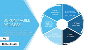
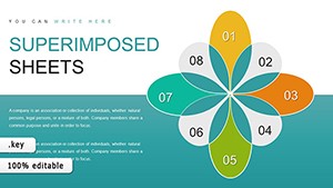
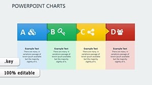
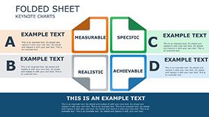
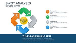
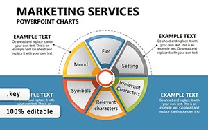
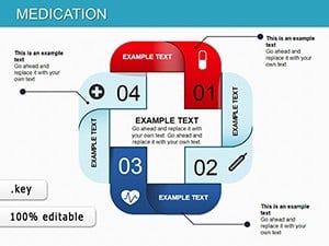
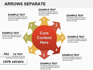
A range from bar, line, and area to advanced like waterfall and Pareto for comprehensive marketing needs.
Yes, copy-paste or link directly for automatic updates.
Fully - adjust timing, direction, and easing via Keynote`s inspector.
Efficient rendering supports thousands of points with drill-down capabilities.
Optional 3D views for emphasis, toggleable for flat alternatives.
Export as images, PDFs, or interactive widgets for reports.
Word count approximation: 950. Let your data dazzle - charts that clarify and captivate in equal measure.
Copyright © 2009-2026 ImagineLayout All rights reserved.