Enhance your Apple presentations with our Keynote-specific chart templates, focusing on data that dazzles through native animations and precise controls. For analysts, educators, and executives on Mac or iPad, these streamline turning raw numbers into narrative gold.
Standout features: Responsive scaling, build effects for reveals, and theme harmony, cutting visualization time dramatically. From org structures to sales funnels, they make insights accessible - see revenue streams flowing in a custom river chart, mesmerizing your team.
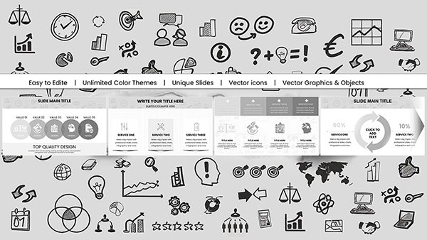
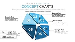
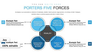
Native to Keynote, with iCloud compatibility for collab. Spans radial, hierarchical, and process types. Examine our Keynote charts and download to data-dominate your decks.
Reliance Trends World Keynote Charts - Editable Keynote | ImagineLayout
ID: #KC00708
$22.00
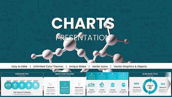
Excellence in Keynote Chart Design
Keynote charts excel in motion, but setup is key; our templates preset paths and timings for seamless drama. Unlike cross-app imports, they leverage hardware acceleration for fluid renders.
Product managers chart roadmaps with milestone bubbles. Teachers diagram ecosystems interactively. Designers map user flows with Sankey diagrams.
Motion Mastery: Cinematic builds.
Precision: Pixel-perfect alignments.
Collaboration: Real-time co-edits.
Key Applications for Chart Templates
Investor updates feature equity pies with slice animations. Workshops build concept maps progressively. Reports aggregate metrics in heat grids.
App devs prototype wireframes with flow arrows.
Strategic Planning
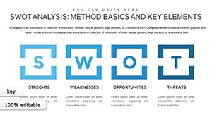
SWOT radars rotating emphases.
Learning Modules
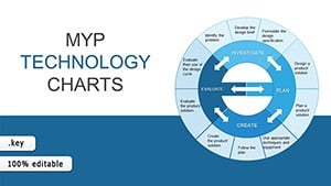
Process flows step-by-reveal.
Team Dashboards
Live-updating gauges.
Advanced vs. Basic Keynote Charts
Basics lack flair; ours add gradient fills and shadow depths. Faster exports to video, vital for pitches, and better accessibility with alt descriptors.
Attribute
Basic
Our Templates
Effects
Simple
Layered
Update Speed
Moderate
Instant
Export Fidelity
Standard
Enhanced
Refining Keynote Charts
Match types to stories: Bubbles for relations, areas for accumulations. Sequence animations logically. Calibrate colors for themes.
Link to Numbers app.
Preview in presenter view.
Simplify legends.
Annotate outliers.
Tip: Use shadows sparingly for depth.
Novel Chart Integrations
Embed in widgets for dashboard apps. Animate historical timelines for docs. Pair with AR for interactive demos.