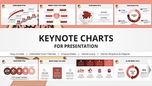
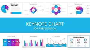
Streamline your supply chain narratives with our logistics-oriented Keynote chart templates. Developed for operations leads and analysts, these feature Gantt timelines, flow diagrams, and KPI dashboards that map processes precisely. From warehouse workflows to delivery routes, visualize efficiencies to guide teams toward peak performance.
Advantages: Auto-updating data links, intuitive drag interfaces, and scalable exports. Concentrate on strategy, not slide-building, for sharper decisions.
Examine our targeted offerings and select a template to enhance your logistics discourse. Download promptly to map success.
Goals and Activities Keynote Charts Template Download
ID: #KC00602
$18.00
(159)
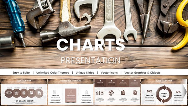
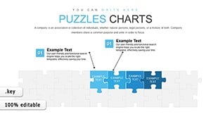
Great Value Keynote Charts Template: Mastering Relationship Visuals
ID: #KC00601
$20.00
(739)
SDG Keynote Charts Template - Fully Editable
ID: #KC00592
$15.00
(1017)
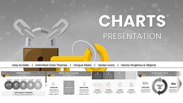
Development Trends Keynote Charts: Visualizing Tomorrow's Innovations
ID: #KC00581
$22.00
Charting Success in Logistics Management
Logistics demands visibility - our Keynote templates provide it via robust charts. Illustrate inventory turns, freight costs, and bottleneck analyses with precision tools that reveal opportunities. Supply chain pros value the modularity, adapting to e-commerce surges or global disruptions.
Exceeding basic diagrams, these incorporate conditional formatting and multi-series plots for nuanced insights. Align with industry standards like SCOR models effortlessly.
Implement best practices: Use benchmarks for context and annotations for clarifications. This drives actionable intelligence across departments.
Case Studies and Optimization Tips
A distributor might employ Sankey diagrams for material flows; a forwarder could use radar charts for vendor evaluations. Illustration: A 3PL firm depicting order fulfillment with swimlane processes, identifying delays. Or a retailer forecasting demands via exponential smoothing curves.
Incorporate geospatial layers for route visuals. Prepare for audits with exportable reports, ensuring compliance.
Drive Logistics Excellence
Fortify your operational storytelling with these insightful templates. Download and implement for streamlined workflows. Browse our process mapping resources next.