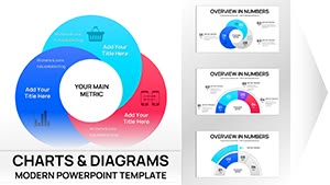
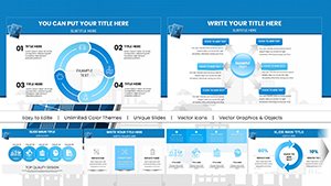
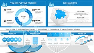
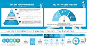
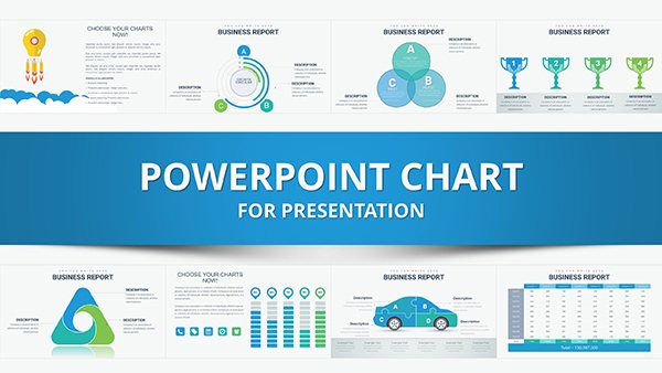
Our investments-focused Keynote charts templates are crafted to assist financial analysts, investors, and advisors in presenting complex data with ease. These templates include a variety of chart types such as line graphs for market trends, pie charts for portfolio allocations, and bar graphs for performance comparisons, all themed around investment strategies. Ideal for quarterly reviews, pitch decks, or educational sessions, they help convey insights on returns, risks, and opportunities clearly. Users appreciate the drag-and-drop functionality that allows quick data integration, ensuring presentations are both informative and visually appealing. Dive into our assortment to select templates that align with your analytical needs and streamline your financial storytelling.


These Keynote templates excel in diverse financial scenarios. Portfolio managers use them to display asset distributions and historical returns, aiding in client consultations. Startups pitching to investors leverage dynamic charts to forecast growth and highlight funding requirements. Educational workshops on stock markets employ these visuals to explain concepts like diversification and compounding interest.
In corporate finance, executives present budget allocations and ROI analyses during board meetings, using customizable graphs to emphasize key metrics.
Basic Keynote charts lack the specialized themes and pre-built formulas found here. Our templates offer investment-specific layouts, like candlestick charts for stock prices, reducing setup time and enhancing accuracy. This leads to more persuasive presentations compared to generic options that often require manual adjustments.
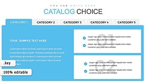
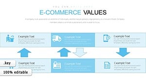
Standout elements include interactive legends, color-coded risk levels, and scalable vectors for high-resolution displays. Best practices involve selecting charts that match data types - use area charts for cumulative totals - and labeling axes clearly for audience comprehension.
Creative uses include integrating charts into annual reports or online webinars, where animations reveal data progressively for better engagement.
Elevate your financial discussions - explore these templates today.
For instance, a financial advisor utilized these charts to illustrate retirement planning, showing projected growth via compound interest graphs, which helped clients visualize long-term benefits.
In venture capital, templates facilitate due diligence presentations by charting startup metrics against industry benchmarks, aiding decision-making processes.
Market analysts employ them for trend reports, using line charts to track indices over time and identify patterns.
Additional tips: Incorporate tooltips for detailed data points and ensure mobile compatibility for on-the-go reviews.
By tailoring templates to specific investment themes, such as real estate or equities, you create targeted visuals that resonate deeply.
Ready to visualize your data? Download a template now and start analyzing.
Copyright © 2009-2026 ImagineLayout All rights reserved.