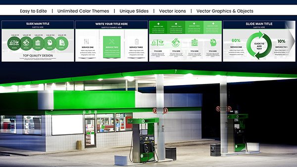
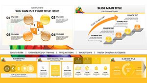
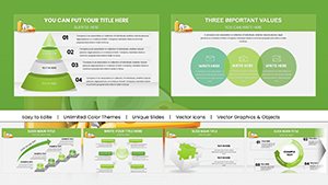
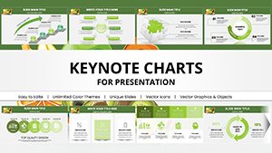
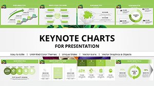
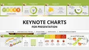
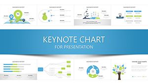
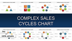
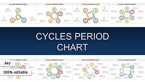
Harness the elegance of Apple Keynote with our chart templates, turning raw data into persuasive visuals that command attention. Suited for Mac users in creative and analytical roles, these templates simplify complex datasets into fluid, story-driven graphics.
Benefits abound: Native animations for smooth reveals, theme harmony for brand consistency, and export options for cross-platform sharing. Professionals, analysts, and presenters save time while amplifying message retention.
Curate your charts from our selection and download to ignite your next keynote.
PowerPoint charts lag in fluidity; Keynote templates leverage hardware acceleration for buttery animations. Pre-styled axes and legends reduce tweaks, versus manual alignments elsewhere.
Color-code intuitively - warm for gains, cool for cautions. Limit series to five for clarity. Technique: Build charts progressively, unveiling insights timed to speech.
Integrate with Numbers for live data pulls. Templates prime these features out-of-the-box.
Download and chart your path to compelling keynotes.
Frequently Asked Questions
What chart types are in the library?
Line, bar, pie, scatter, bubble - plus hybrids for nuance.
Compatible with all Keynote versions?
From 2016 onward, with iCloud sync for devices.
Animation customization easy?
Drag timelines adjust speeds and sequences effortlessly.
Export to other formats?
PDF, PowerPoint, video - retaining animations where possible.
Data import from Excel?
Direct CSV/Excel links update charts dynamically.
Accessibility features included?
Alt text prompts and high-contrast modes built-in.
Visualize triumphantly - acquire a Keynote chart template today.