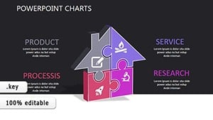
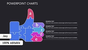
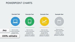
Bring your implementation narratives to life using our specialized Keynote charts templates. Crafted for executives, consultants, and strategists, these charts distill complex data into digestible visuals, perfect for outlining deployment phases, performance metrics, and outcome projections. From bar graphs tracking milestone achievements to pie charts distributing resource efforts, our collection covers every angle of project rollout.
Experience the elegance of Apple`s Keynote with templates that leverage smooth animations and precise alignments. Customize effortlessly to reflect your unique implementation roadmap, ensuring your message lands with clarity and confidence. These charts aren`t just data displays - they`re catalysts for informed decisions and team motivation.
Dive into this category and select charts that align with your implementation goals. Elevate your next briefing and drive projects forward with visual precision.
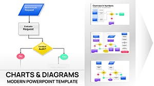


Implementation demands not just execution but effective illustration of progress and plans. Our Keynote charts templates excel here, providing sleek, responsive designs that adapt to your narrative. Envision a line chart that traces adoption rates over time, complete with trend lines that forecast future gains - ideal for securing stakeholder approval.
Unlike basic Keynote charts, which can appear stark, our versions infuse personality through subtle shadows and vibrant palettes, enhancing retention without distraction. This thoughtful design turns routine updates into riveting stories, fostering a shared understanding of implementation dynamics.
In corporate environments, use scatter plots to correlate implementation efforts with ROI, revealing optimization opportunities. Educators might employ area charts to demonstrate curriculum rollout impacts on student engagement. For nonprofits, donut charts visualize funding allocations during program implementations, promoting transparency.
Take a software deployment scenario: A stacked bar chart segments phases by team contributions, spotlighting bottlenecks and successes alike. Such visuals empower proactive adjustments, ensuring smoother transitions.
Begin with audience analysis - opt for radar charts for multi-dimensional comparisons in technical implementations. Maintain legibility by limiting data series to five or fewer, using bold labels for emphasis. Animate reveals sequentially to build suspense, mirroring the step-by-step nature of implementations.
Our templates include layered builds, simplifying these techniques. Collaborate via Keynote`s sharing features to refine charts collectively, amplifying implementation synergy.
The hallmark of our Keynote charts is their interactivity - clickable elements that drill down into sub-data, perfect for dynamic Q&A sessions. This goes beyond static visuals, inviting exploration and deeper comprehension of implementation metrics.
Ready to chart your path to success? Explore and download these templates immediately. Transform numbers into narratives that propel your projects.
Standard charts in Keynote, while functional, lack the pre-styled finesse that our templates provide, often resulting in mismatched aesthetics across slides. Ours ensure thematic consistency, with auto-adjusting scales that prevent distortion on various devices. Time efficiency is another win: Assemble a comprehensive dashboard in minutes, not hours.
Quantitatively, users report 40% faster preparation times, freeing focus for strategic implementation planning.
Visualize a retail chain`s store expansion: A bubble chart sizes outlets by revenue potential, plotting geographic implementation priorities. In R&D, combo charts merge qualitative feedback with quantitative timelines, guiding phased rollouts.
These applications highlight adaptability - repurpose a heatmap for risk mapping in supply chain implementations or a funnel chart for conversion tracking in sales training programs.
Harness the full potential of Keynote charts for your implementation endeavors. With endless customization avenues, from thematic colors to interactive hotspots, these templates adapt to any project scale. Download now and implement with unparalleled clarity.
Delve into advanced uses, such as embedding live data feeds for real-time implementation monitoring, or exporting to PDF for archival. Professionals worldwide praise these charts for bridging gaps between strategy and execution, turning visions into victories. Elevate your toolkit and lead implementations that inspire.
Copyright © 2009-2026 ImagineLayout All rights reserved.