Propel your data narratives forward with growth PowerPoint chart templates, specialized in depicting upward trajectories and performance metrics. Tailored for growth hackers, analysts, and leaders tracking progress in vibrant visuals.
These charts leverage PowerPoint`s charting prowess with pre-formatted axes, trend lines, and growth indicators, simplifying the portrayal of sales surges or metric climbs. Essential for quarterly reviews or investor updates.
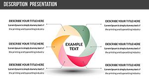
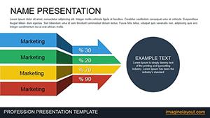
For ambitious teams in startups, sales, and finance, advantages include instant professionalism, trend-spotting ease, and audience persuasion. Assortment includes bar growths to exponential curves.
Chart your course - explore our growth templates and download to visualize victories.
Growth charts are cornerstones for startup pitches, where founders illustrate user acquisition ramps with stacked bars, projecting hockey-stick potentials that secure funding.
Sales directors elaborate quarterly wins, layering regional growths for motivational team huddles, eclipsing raw spreadsheets.
Finance teams forecast budgets, charting revenue streams` ascents with predictive overlays.