Illuminate your success metrics with our growth Keynote charts templates, designed for executives, marketers, and analysts. These precise tools turn numbers into narratives, showcasing expansions in revenue, user bases, or market reach with elegance and accuracy.
From exponential curve lines to stacked area plots, each chart boasts clean axes, thematic colors, and data placeholders ready for your inputs. Suited for investor updates or performance reviews, they ensure your insights land with precision and poise.
We craft for intuitiveness, with tooltips and legends that enhance readability. Elevate routine data dumps into strategic showcases. Scan this category for the chart that amplifies your growth tale.
Poised for progress? Download a growth Keynote chart template and chart your course forward.

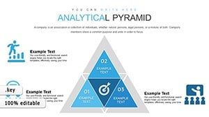


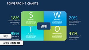
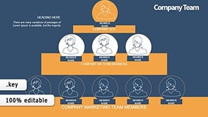
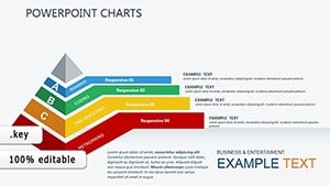
Growth charts are vital for quantifying ambition. In sales teams, they track quarterly targets with progress bars, revealing pipeline health. HR departments visualize workforce expansion via pyramid structures, layering roles from entry to executive.
Startups pitch valuations using hockey-stick graphs, while environmental reports chart sustainability gains in donut segments. Non-profits map donor trends with line series. These charts adapt to finance, operations, and beyond, quantifying journeys universally.
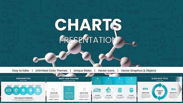
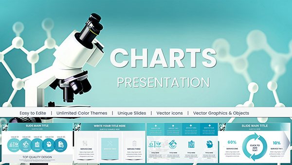
Native charts lack flair; ours integrate growth motifs like ascending vines or metric waves, with auto-scaling grids for varied datasets. This pre-formatting trumps manual tweaks, yielding sharper, brand-aligned visuals out of the box.
Highlights: Responsive legends that float on resize and export-ready formats for reports. Best practices: Anchor with context slides, use benchmarks for scale, and cap series at five for focus. Animate builds from zero to value for drama.
Creatively, fuse charts with icons for hybrid infographics or embed forecasts via trendlines. Sample: A revenue growth bubble chart sizing by region, popping with details on click.
For a product launch, employ a multi-line chart comparing variants` adoption rates over time. In education, radar charts assess skill growth across competencies. Pilot with small audiences, iterating on label clarity.
Opt for accessible scales like large fonts and patterns over pure color. Innovate with real-time data links for live updates in sessions.
From simple bars to advanced scatters, our range covers all growth angles. Bolster with color theory resources for harmony.
Secure a growth Keynote charts template now and plot your ascent with confidence.
Copyright © 2009-2026 ImagineLayout All rights reserved.