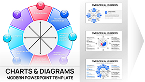
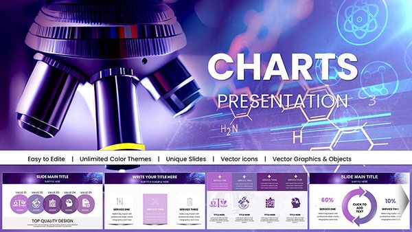
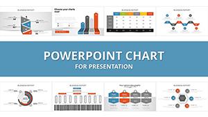
Harness the full spectrum of data visualization with our graph templates for PowerPoint charts, created for experts who turn numbers into actionable stories. From trends to correlations, these tools simplify complexity into digestible graphics.
Analysts tracking performance metrics, researchers plotting experimental results, or executives forecasting growth will find unmatched utility in these versatile designs. Featuring grid alignments, trend lines, and error bars, they support rigorous data integrity.
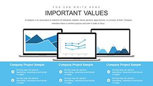
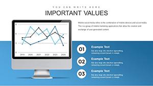
Envision spiking lines that trace revenue surges or clustered bars comparing quarterly yields - our templates deliver that precision with flair. Quick-formula integrations make updates a breeze.
Scan this collection to arm your presentations with graphs that reveal truths and spark strategies.
Graphs distill vast datasets into patterns, and our PowerPoint templates amplify this with advanced formatting options like dual axes and logarithmic scales. Outpacing default charts in aesthetics and functionality, they include thematic overlays for contextual depth.
Sales teams plot funnel conversions, while scientists graph variable interactions with confidence intervals baked in.
Key Differentiators
Trend Accuracy: Smoothing algorithms for clean, interpretable lines.
Multi-Series Support: Layered plotting without overlap issues.
Annotation Tools: Built-in callouts for highlighting peaks and troughs.
Such features elevate analysis from mere display to strategic dialogue.
Targeted Use Cases by Discipline
Economics: Scatter plots reveal correlation coefficients in policy impacts.
Healthcare: Line graphs monitor patient outcomes over interventions.
Tech: Bar stacks compare feature adoption rates across versions.
Flexibility ensures relevance in any data-heavy arena.
Best Practices for Graph Design
Choose graph types matching data nature - lines for time series, bars for categories.
Avoid chart junk; opt for minimal grids and labels.
Color-code series logically, using contrasts for accessibility.
Include source footnotes for credibility.
Adopt these for graphs that communicate unequivocally.
Novel Graph Integrations
Combine heat maps with lines for multidimensional views in climate modeling. E-commerce uses bubble graphs sized by revenue for product insights. Gamification apps track engagement curves with overlaid benchmarks.
Spotlight: A market research deck graphing consumer sentiment waves, informing pivot decisions crisply.
Innovate to tailor graphs to your unique insights.
Select and Secure Now
Review our graph template variety and download to sharpen your PowerPoint data edge without delay.