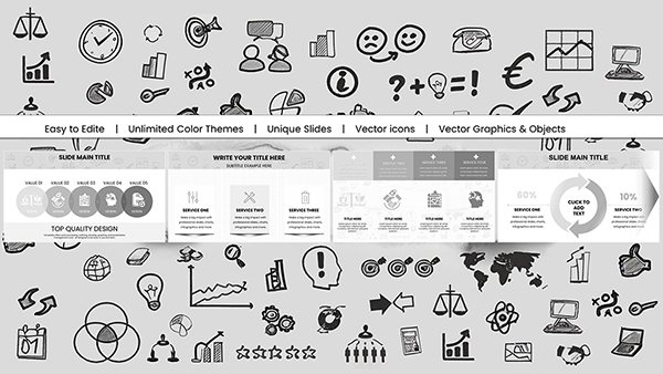
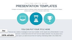
Illuminate trends with graph chart templates crafted for Keynote. Vital for economists, marketers, and presenters charting progressions or comparisons, these tools turn timelines into tales. Line graphs, area fills - all at your fingertips for dynamic displays.
Analytical Accounting Keynote Charts Template: Illuminate Financial Data with Expert Visuals
ID: #KC00609
$19.00
(1136)
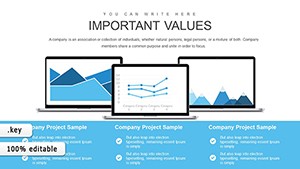
Assessment of Technical Condition Keynote Charts: Precision in Process
ID: #KC00605
$18.00
(131)
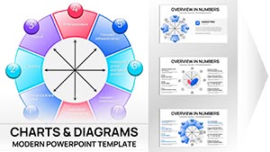
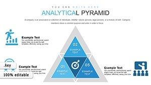
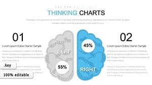
Maslow Needs Pyramid Keynote Charts Template
ID: #KC00598
$23.00
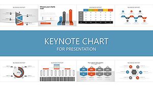
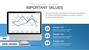
Graph Charts: Keynote Trend Tellers
Graph charts trace changes over time or categories, unearthing rises, falls, or plateaus - key for forecasting in volatile markets or seasonal analyses.
Elevated with error bars and dual axes, beyond stock simplicity, for robust variance depiction in research or sales.
Strategic Scenarios
E-commerce: Sales trajectory lines.
Fitness: Progress area graphs.
Environment: Pollution scatter plots.
Media: Engagement step charts.
Adhere to smooth curves and grid aids. Creative twist: Gradient fills for momentum visualization.
Keynote Graph Polish
Layer series with opacity controls. Example: Multi-line graphs for competitor benchmarks, spotlighting leads.
Distinct: Spline interpolation for elegant curves. Link to live data for updates.
Inspired? Snag a chart template.
Fine-Tuning
Normalize scales for fairness.
Annotate peaks/valleys.
Sync legends to themes.
Rehearse transitions.
Perfect for persuasive plotting.
Vivid Vignettes
A brand tracked social metrics: Spikes correlated campaigns, optimizing spends. Students graphed historical events, contextualizing eras.
Whimsical: Recipe yield curves for bakers. Bonus: High-DPI exports.
Frequently Asked Questions
Chart courses confidently. Download Keynote graphs today for trend triumphs.