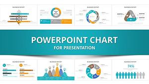
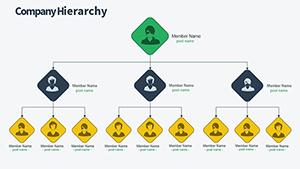
Charts in PowerPoint turn numbers into narratives, making data accessible and persuasive. Our template library targets analysts, executives, and presenters who need to convey insights swiftly and stylishly.
Explore bar, line, pie, and scatter options, each engineered for accuracy and appeal. Adjust scales, labels, and legends with minimal effort, integrating seamlessly into your deck.
Suited for quarterly reviews, investor updates, or research findings, these charts amplify your message`s clarity. Select a template and plot your path to compelling slides.
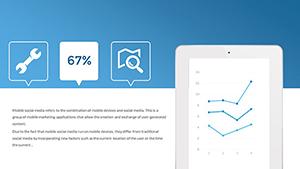


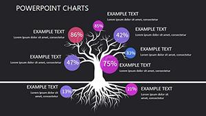
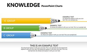
Charts drive informed decisions in various contexts. Sales teams visualize quarterly trends with line graphs, spotting growth opportunities. HR uses pie charts for demographic breakdowns in diversity reports.
Scientists plot experimental results via scatter diagrams, revealing correlations. E-commerce dashboards employ bar charts for product performance metrics. Non-profits track fundraising with area charts, showing impact over time.
These uses highlight charts` power in simplification and persuasion.
Built-in charts often suffer from rigid formatting and bland palettes, hindering customization. Our versions introduce thematic styles, conditional formatting, and 3D effects for depth. Defaults lack data import ease, but ours support Excel linking for real-time updates.
Responsive designs adapt to slide ratios, preventing distortion.
| Capability | Default | Enhanced |
|---|---|---|
| Data Linking | Static | Dynamic Excel |
| Style Options | Basic themes | Custom palettes |
| Interactivity | None | Hover effects |
Experience the upgrade in engagement.
Precision legends and axis tools ensure accuracy, while minimalist backgrounds keep focus on data. Multi-series support handles complex datasets effortlessly. Exportable to infographics for social sharing.
Accessibility compliance with ARIA labels enhances usability.
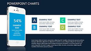
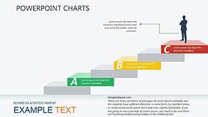
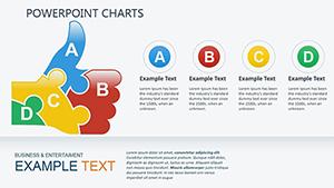
Choose chart types matching data nature - lines for trends, bars for categories. Cap series at four for clarity. Annotate key points with callouts.
A revenue forecast line chart with trendlines can forecast futures vividly.
Download charts to data-fy your presentations. Clarity calls.
Insights for optimal use.
Copyright © 2009-2026 ImagineLayout All rights reserved.