Geometry based charts bring order clarity and visual logic to complex information. This collection of Keynote geometry chart templates is designed for presenters who want structure precision and modern aesthetics in every slide.
These ready to use templates help you turn abstract numbers into clear visual stories using shapes grids and proportional layouts that audiences instantly understand.
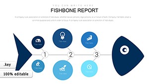
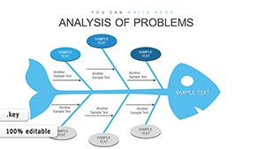
Fishbone Diagram Keynote Template: Root Cause Analysis
ID: #KC00889
$20.00
(32)
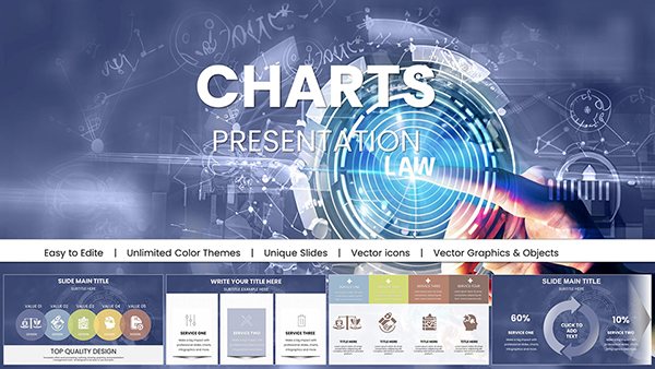
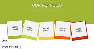
Our Portfolio Keynote Charts
ID: #KC00886
$20.00
(1114)
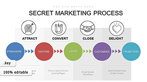
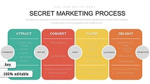
Inbound Marketing Methodology Keynote Charts: Strategize for Success
ID: #KC00882
$15.00
(395)
Ishikawa Fishbone Analysis: Master Problem Solving with Keynote Charts
ID: #KC00861
$18.00
(66)
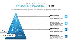
Pyramid Financial Risks Charts: Master Risk Visualization in Keynote
ID: #KC00857
$16.00
(769)
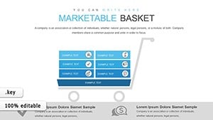
Marketable Basket Matrix Keynote Template for Economic Analysts
ID: #KC00853
$20.00
(223)
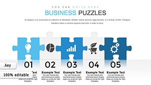
Business Puzzles Keynote Charts Template
ID: #KC00851
$18.00
(678)
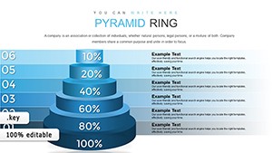
Pyramid Ring Keynote Charts: Master Farm Activity Analysis
ID: #KC00847
$18.00
Why Choose Geometry Charts in Keynote
Geometry charts rely on balance alignment and proportion. Instead of decorative effects they focus on visual logic. This makes them ideal for professional environments where clarity matters more than decoration. Every slide in this collection is built to support confident storytelling in meetings classrooms and investor presentations.
Real World Use Cases
Business reports with structured comparisons and KPIs
Educational slides explaining concepts processes or relationships
Marketing presentations that need clean visual hierarchy
Strategy decks for consultants and analysts
Benefits Over Default Keynote Charts
Default charts often look generic and lack visual consistency across slides. Geometry templates provide a unified design language using consistent shapes spacing and typography. This saves time and elevates the overall look of your presentation without manual adjustments.
Professionally aligned shapes and grids
Editable colors fonts and data
Slides designed for modern widescreen formats
Creative Tips for Better Results
Use limited color palettes to emphasize key data points. Combine geometric charts with short labels instead of long text blocks. Keep animations subtle to maintain a professional tone and guide attention logically.
Download these geometry Keynote charts to build presentations that feel confident organized and easy to follow.
Frequently Asked Questions
Are these charts fully editable in Keynote
Yes all shapes colors text and data points can be customized directly in Keynote without additional tools.
Who should use geometry chart templates
They are ideal for business professionals educators consultants and students who need clean and logical visuals.
Do these templates support animations
Yes basic animations can be applied to highlight data flow or sequence without breaking the layout.