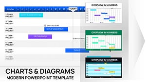
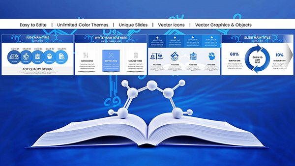
Navigate projects smoothly on Mac with our Gantt Keynote charts, perfected for strategists, creatives, and leaders. Horizontal timelines bar-code durations, integrating baselines and variances for accurate forecasting.
Designed for design agencies, research groups, and nonprofit directors, charts boast curved aesthetics suiting Apple`s polish. Key perks: Intuitive resizing, baseline comparisons, and export-ready formats that preserve elegance.
Tailor to your narrative - elongate phases, nest sub-tasks, and theme colors for branding. Suited for creative timelines or rigorous audits, they harmonize form and function. Venture into the category to chart your ambitions - set sail with sophistication.
Analytical Accounting Keynote Charts Template: Illuminate Financial Data with Expert Visuals
ID: #KC00609
$19.00
(131)
Maslow Needs Pyramid Keynote Charts Template
ID: #KC00598
$23.00
(1186)
Data Analysis Graphs Keynote Charts Template
ID: #KC00597
$15.00
Refining Projects with Keynote Gantt Charts
Keynote`s grace meets Gantt rigor in our charts, crafting timelines that feel native yet powerful. They surpass web tools by embedding deeply, with smooth pans across long horizons. Default bars are blunt; ours gradient-fill for depth, signaling urgency with hues.
Agencies sequence shoots, from scouting to edits. Researchers phase studies, with gates for reviews. Nonprofits roadmap impacts, linking funds to outcomes.
Baseline Layers: Overlay originals against currents for drift detection.
Sub-Task Nesting: Indent for hierarchy without chaos.
Export Fidelity: Retain vectors for sharp shares.
Diverse Scenarios for Gantt Mastery
Conceive a product beta: Charts arc from prototypes to feedback loops, pinpointing pivots. Editorial calendars fill with deadlines, color-wheeling priorities. Fitness programs timeline regimens, milestones for plateaus.
Outshining fragments, they unify views, slashing alignment time. Sync with iCloud for collab fluidity.
Elevating Chart Craftsmanship
Anchor anchors: Fix dates for stability amid shifts.
Tint tactics: Spectrum-code statuses for subconscious cues.
Animate arcs: Reveal progress in waves for drama.
Augment with hyperlinks to docs, streamlining navigations. Forecast via extensions, projecting completions.
Creative Evolutions in Gantt Usage
Harness for content pipelines, funneling ideas to publishes. Event firms orchestrate logistics, buffering weathers. Educators plot curricula, adapting to paces.
Steer ahead? Examine Gantt Keynote charts and initiate your itinerary. Mac magic manifests quickly.