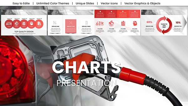
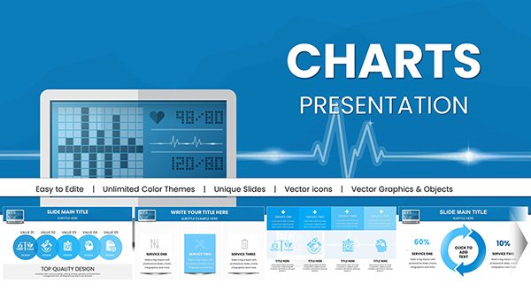
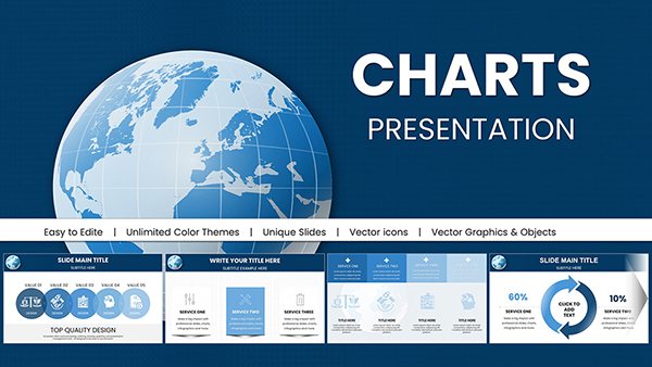
PowerPoint remains a staple for financial pros seeking to distill complex data into persuasive visuals. Our financial PowerPoint chart templates are engineered to make your spreadsheets sing, with layouts optimized for everything from cash flow diagrams to equity valuations.
Ideal for executives, analysts, and educators, these templates cut through the noise of standard slides. Insert your metrics and let column charts, area graphs, and gauges bring fiscal narratives to vivid life, ensuring your points stick with stakeholders.
Designed with PowerPoint`s robust features in mind, they include smart art placeholders and theme consistency for effortless branding. From somber tones for risk reports to energetic hues for growth decks, match the mood to your message.
Peruse our PowerPoint charts assortment and equip your toolbox with designs that elevate data to decision-making gold.

These templates power diverse needs, like sales teams using combo charts to overlay revenue against expenses in pipeline reviews, or HR finance leads tracking compensation trends with line series. In academia, they aid in econometric modeling, visualizing regression lines for policy impacts.
Investment bankers favor them for M&A due diligence, where waterfall visuals unpack deal structures. PowerPoint defaults pale in comparison, lacking specialized scales for percentages or logarithmic views essential for exponential growth charts.
While PowerPoint`s insert chart is functional, it requires extensive tweaking for financial accuracy. Our templates arrive polished, with error bars for volatility and dual axes for comparative metrics, slashing edit time and enhancing precision.
Key perks: vector-based scalability for prints and interactive hyperlinks for drill-downs, turning static slides into dynamic explorations.
Enhance impact by embedding icons alongside bars for categorical emphasis, like dollar signs on revenue spikes. For sustainability reports, use polar charts to radar out ESG scores, blending finance with forward-thinking appeals.
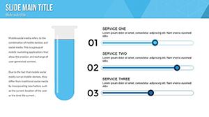
Adhere to guidelines: cap series at five for clarity, use consistent units, and test on projectors for color fidelity. Spotlight templates such as "Profitability Metrics Charts" for ratio breakdowns.
Ready for sharper insights? Download PowerPoint chart templates and refine your financial visuals.
Extend utility to fraud detection, where anomaly charts flag outliers in transaction data. Finance ops in e-commerce deploy them for A/B testing revenue lifts.
Superior to ad-hoc creations, these templates enforce accessibility with alt text prompts and high-contrast modes. Practice variance labeling for deeper dives, a staple in our designs.
Tax advisors visualize deduction flows with process maps, demystifying filings. Enhance your deck with these expert charts today.
From crypto trading dashboards to real estate valuations, adapt visuals to niches. This flexibility, rooted in user-centric design, makes every presentation a powerhouse.
Copyright © 2009-2026 ImagineLayout All rights reserved.