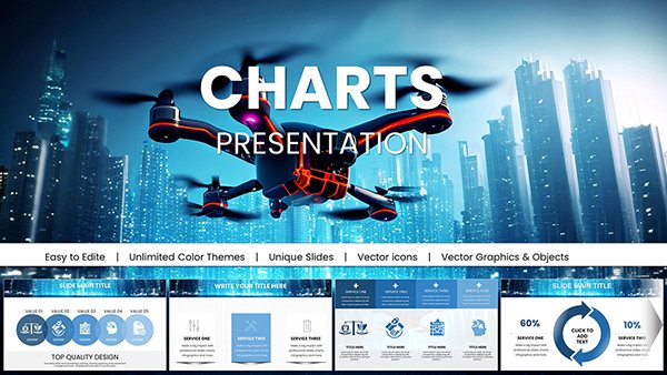
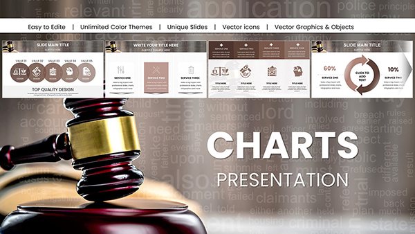
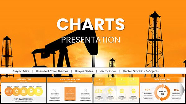
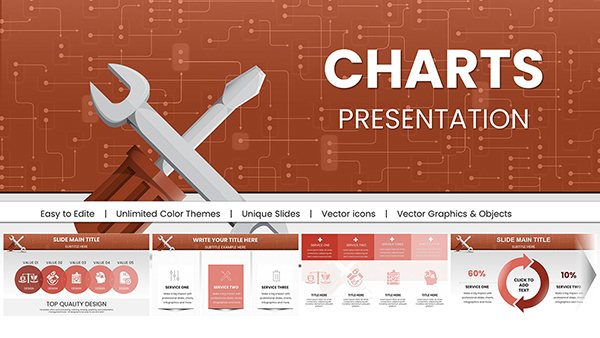
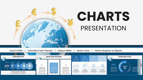
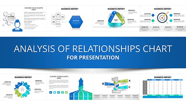
Communicate financial results confidently with our specialized financial performance chart PowerPoint templates. These precise designs help you present complex numbers clearly and professionally.
Over 100 dedicated financial templates featuring clean layouts accurate scaling animations and full customization.
Perfect for earnings calls investor updates or budget reviews.
Begin with free financial charts or upgrade to premium for advanced waterfall and combination styles.
Make your financial story credible and compelling.
Financial presentations demand accuracy and clarity. Our templates provide the right chart types and styling to convey performance metrics effectively.
From simple bars to sophisticated combinations every design prioritizes readability.
Critical Applications in Finance
Financial charts are essential for:
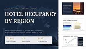
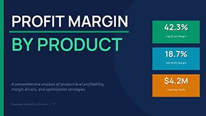
Investor presentations showing revenue growth profit margins and year-over-year comparisons.
Board meetings highlighting KPI achievement and financial health indicators.
Annual reports illustrating balance sheet trends or cash flow.
Budget planning sessions comparing actual vs forecasted numbers.
Profit and loss breakdown
Revenue stream analysis
Cost structure visualization
These uses ensure stakeholders understand performance quickly.
Why Specialized Templates Matter
Generic charts fall short for financial data. Our templates include proper scaling currency formatting trend lines and professional color coding that instill trust.
Best Practices for Financial Charts
Present financial data effectively by:
Using consistent decimal places
Highlighting positive trends in green
Including clear currency symbols
Combining chart types when needed
Select a financial performance template from our collection and download it to prepare your next report with confidence.
Frequently Asked Questions
Do financial templates support currency formatting?
Yes labels and axes can display currency symbols and proper formatting.
Are waterfall charts included?
Many premium financial templates feature waterfall designs for variance analysis.
Can I combine multiple chart types?
Yes several templates combine columns lines and markers for comprehensive views.
Are free financial templates available?
Yes start with free professional designs and upgrade for specialized features.