Harness the sophistication of Keynote with our financial performance chart templates, ideal for finance directors, auditors, and planners seeking to articulate balance sheets, forecasts, and variances with finesse. These charts blend Apple`s design ethos with fiscal rigor, from radar plots for balanced scorecard assessments to timeline charts for yearly progressions.
Seamlessly adjustable for thematic consistency, they enable nuanced storytelling that resonates in earnings calls or budget meetings. Transform dense data into digestible, beautiful visuals that underscore performance narratives.
Navigate this category to find your ideal financial chart. Inspire confidence and clarity in every presentation.


Keynote`s native elegance shines in financial contexts, amplified by our performance-oriented chart templates. A chord diagram can map inter-departmental transactions, unveiling efficiency leaks. These tools distill quarterly essence, facilitating agile financial steering.
Basic Keynote charts miss specialized financial styling, but ours embed currency symbols and percentage automatics, streamlining professional outputs.
Asset managers use horizon charts for return distributions, spotting outliers. Charities apply alluvial diagrams for donation flows, enhancing donor reports. E-commerce leaders favor violin plots for sales volatility analyses.
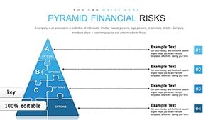
For budgeting, a population pyramid contrasts expense categories, balancing allocations astutely.
Tailor to metrics - employ box-and-whisker for outlier detection in performance data. Sustain neutrality with grayscale accents, and phase in elements to echo fiscal periods. Leverage Keynote`s magic move for smooth transitions between charts.
Included are style sheets for rapid brand alignment.
Unique is the scenario modeling capability, toggling variables to simulate performance what-ifs. This interactivity elevates discussions beyond observation.
Positioned for success? Acquire these Keynote charts and refine your financial lens.
Stock Keynote charts necessitate bespoke adjustments for financial accuracy, whereas ours are pre-tuned, conserving hours. They excel in multi-device rendering, vital for remote financial huddles, and incorporate AR previews for immersive reviews.
Such advancements ensure your performance visuals are always pitch-perfect.
Insurers might use a Sankey variant for claims processing, tracing costs from incident to payout. In venture capital, a Sankey for funding rounds visualizes dilution effects on performance equity.
Flexibility abounds: Convert a joy plot for multi-year revenue undulations or a lollipop chart for KPI deviations.
With Keynote charts, financial performance becomes a canvas for insight. Encompassing basics to esoterics, they suit solo analysts to enterprise teams. Download forthwith to illuminate your fiscal journey.
Pro hacks involve hyperlinking data sources for verifiability or using shapes for custom icons. Endorsed by fiscal gurus, these have sharpened countless performance edges. Chart your ascent with distinction.
Copyright © 2009-2026 ImagineLayout All rights reserved.