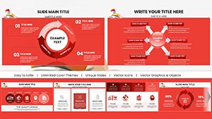
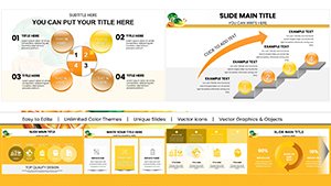
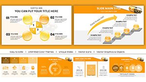
Elevate your Keynote presentations with our specialized factors charts, designed to dissect and display the driving elements behind decisions, processes, or outcomes. These templates transform abstract concepts like market drivers or success metrics into intuitive, animated diagrams that captivate audiences.
Business analysts, educators, and project managers will appreciate how these charts simplify multifaceted topics, from economic factors in reports to psychological influences in team dynamics. With smooth transitions and scalable vectors, they ensure your message lands with precision, whether in boardrooms or classrooms.
Highlight interconnections effortlessly - use color-coded segments to show positive versus negative impacts, or animate builds to reveal layers progressively. Tailored for Apple`s Keynote, these templates integrate seamlessly, saving you hours of manual design.
Transform data into stories: Dive into our factors Keynote charts collection and start crafting compelling narratives today.
Factors charts shine in scenarios requiring nuanced explanations, such as strategic planning sessions where teams evaluate growth drivers like customer satisfaction and operational efficiency. Marketing professionals deploy them to illustrate campaign influences, detailing how social media reach and content quality interplay to boost engagement rates.
In educational contexts, teachers use these for lesson plans on environmental factors affecting climate change, layering icons for human activity, natural cycles, and policy interventions. Healthcare presenters break down patient outcome factors, from lifestyle choices to treatment adherence, fostering informed discussions in seminars.
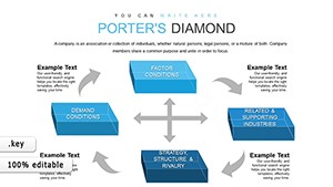
Default Keynote charts often present data in rigid grids or bars that overlook relational dynamics, leaving audiences disconnected from the `why` behind numbers. Our factors templates, however, employ organic shapes and flow lines to depict causality, making abstract influences tangible and memorable.
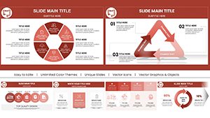
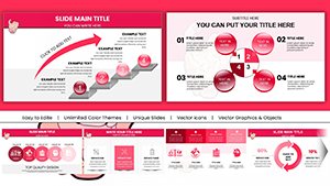
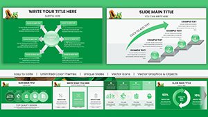
Animation prowess sets them apart - subtle fades reveal factor weights sequentially, building suspense without overwhelming. Unlike stock options limited to two dimensions, these support multi-level hierarchies, accommodating up to eight interconnected elements without clutter. Export-ready for high-res prints or videos, they maintain fidelity across mediums.
The result? Presentations that not only inform but persuade, turning passive viewers into active stakeholders through visual storytelling.
| Aspect | Factors Templates | Basic Charts |
|---|---|---|
| Interconnectivity | Dynamic links | Static elements |
| Animation | Layered builds | Limited transitions |
| Customization | Modular icons | Fixed styles |
Begin with audience analysis: for executives, prioritize high-level overviews with bold metrics; for students, add explanatory callouts. Balance colors - use warms for accelerators and cools for inhibitors - to guide emotional responses. Limit to five core factors per slide to prevent cognitive overload, employing whitespace as a strategic pause.
Incorporate data validation: source factors from reliable studies, footnoting slides for credibility. Test animations in presenter view to ensure timing aligns with your narrative pace. For inclusivity, opt for high-contrast modes accessible to all viewers.
Enhance engagement: Pair charts with rhetorical questions like "What if this factor shifted?" to spark dialogue.
Consider a startup pitch where founders used a central hub-and-spoke chart to showcase product success factors: innovation at the core, radiating to market fit and funding. The animation unveiled spokes one by one, syncing with success stories, clinching investor buy-in.
In academia, a sociology lecture employed a web-like diagram for social mobility factors, with threaded lines showing intergenerational ties - students reported 40% better retention of concepts. Non-profits adapt them for fundraising, visualizing impact factors like community involvement to rally donors.
Ready to influence? Select a factors Keynote chart template and elevate your next presentation.
Copyright © 2009-2026 ImagineLayout All rights reserved.