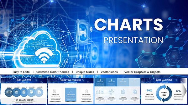
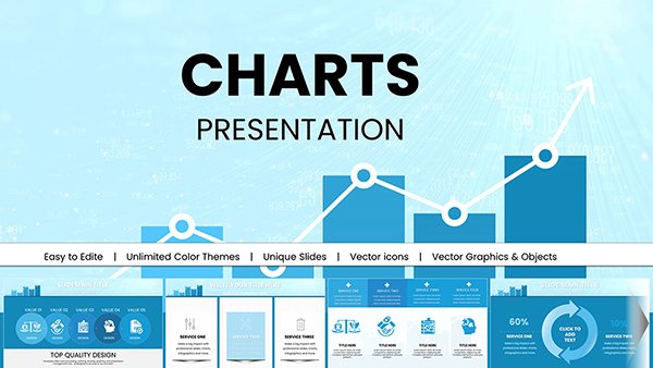
Transform technical data into compelling visuals with our engineering chart PowerPoint templates. Engineered for precision, these slides cater to mechanical, civil, and electrical professionals who need to convey intricate concepts clearly and efficiently.
Featuring modular chart types like Gantt timelines, Sankey diagrams, and vector-based schematics, each template uses a sleek palette of grays, blues, and oranges to denote processes and measurements. Save hours on formatting with drag-and-drop elements that maintain accuracy across resolutions. Whether illustrating stress analysis or workflow efficiencies, these tools ensure your audience grasps the engineering behind the numbers.
Perfect for project managers, consultants, and academics, our collection emphasizes scalability and integration with tools like Excel for real-time updates. Dive into templates that bridge the gap between raw data and strategic insights - start building your next presentation today.


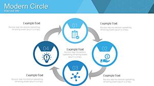
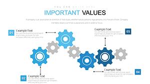
Engineering demands clarity in communication, and our PowerPoint chart templates deliver just that. Unlike basic slide builders, these incorporate industry-specific icons - gears for mechanics, circuits for electronics - and responsive layouts that adapt to slide sizes without distortion. They support layered annotations for detailing tolerances or load factors, making them indispensable for CAD-linked reports.
Audiences range from boardroom executives needing high-level overviews to field teams requiring on-site briefings. Key advantages include reduced cognitive load through color-coded legends and embedded formulas for dynamic calculations, fostering trust in your data-driven narratives.
Versus off-the-shelf charts, ours offer pre-vetted aesthetics that align with standards like ASME, avoiding the pitfalls of mismatched scales or cluttered axes.
Customization starts with selecting base charts - bar for comparisons, scatter for correlations - and layering in your datasets. Employ PowerPoint`s morph transition for smooth animations between states, like evolving prototypes. For best results, limit data points to seven per visual to prevent overload, and always include units in axis labels.
Enhance with hyperlinks to 3D models or simulations, turning static slides into interactive hubs. A case in point: An aerospace firm used our radar chart template to compare material strengths, securing a major contract through crystal-clear comparisons.
Beyond reports, use bubble charts for risk assessments in environmental engineering, sizing bubbles by impact severity. In education, animate line graphs to simulate fluid dynamics, engaging students in real-world problem-solving. These applications not only inform but also innovate, setting your presentations apart.
Discover more engineering chart options and download instantly to fuel your technical storytelling.
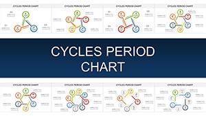
You`ll find Gantt, Sankey, radar, and scatter charts, all optimized for engineering data like tolerances and efficiencies.
Yes, designed for PowerPoint 2013+, with fallback elements for earlier versions to ensure broad usability.
Certainly. Use PowerPoint`s data link feature to pull live updates from Excel spreadsheets for always-current visuals.
Yes, built-in entrance and emphasis effects highlight key data points, with easy tweaks via the animation pane.
Incorporate gridlines and reference lines, and validate scales against source data before finalizing slides.
Our library includes over 200 icons for fields like civil and electrical engineering, fully vector-based for scalability.
Take your engineering visuals to the next level - browse and download these chart templates now.
Copyright © 2009-2026 ImagineLayout All rights reserved.