Economics financial PowerPoint Charts
Harness the clarity of data with our PowerPoint charts specialized in economics and financial themes. These templates provide ready-to-use visuals that decode market dynamics, revenue streams, and economic policies with professional finesse.
Geared toward data analysts, accountants, and business developers, they eliminate guesswork with scalable vectors and formula-integrated placeholders. Elevate reports from mundane to masterful.
Scan the category for charts that fit your narrative, and deliver insights that inform and inspire action across teams.
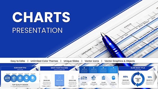
Business Financial PowerPoint Charts - Drive Decisions
ID: #PC01036
Flying Drone PowerPoint Charts Presentation: Capture Aerial Perspectives in Your Slides
ID: #PC01019
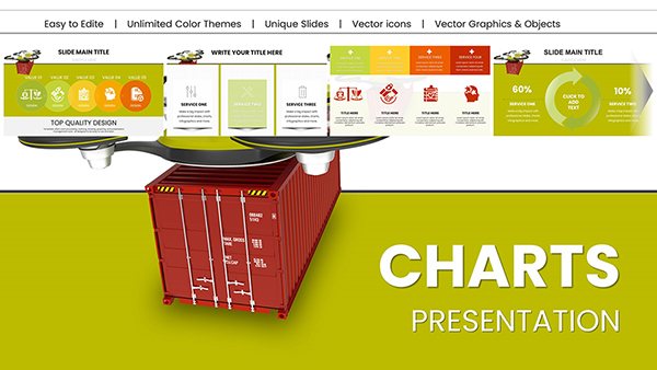
Heavy Cargo Drone Delivery PowerPoint Charts - Download Logistics Templates
ID: #PC01014
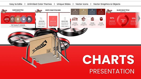
Drone Delivery PowerPoint Charts Presentation: Chart the Course of Modern Logistics
ID: #PC01013
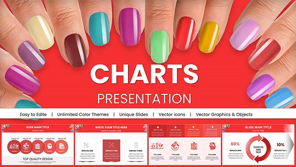
Manicure PowerPoint Charts Presentation Template
ID: #PC01009
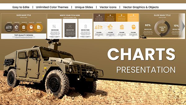
Military Vehicle PowerPoint Charts Template
ID: #PC01008
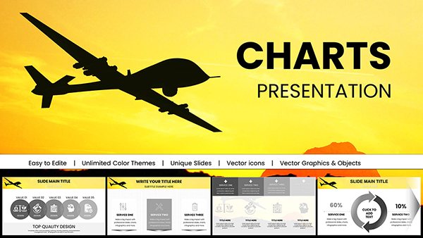
Military Technology Drone Warfare PowerPoint Charts Template
ID: #PC00997
Sharpshooter PowerPoint Charts Template for Precision Presentations
ID: #PC00995
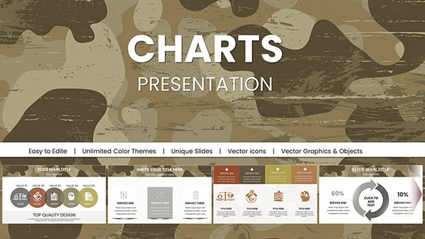
Military Camouflage PowerPoint Charts Templates
ID: #PC00994
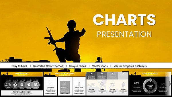
War Armed Forces PowerPoint Charts - Download Presentation
ID: #PC00993
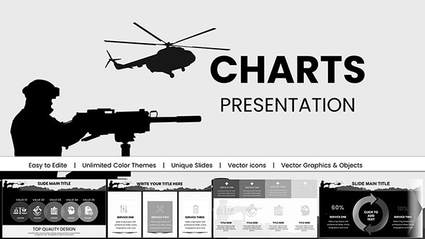
Battle Military PowerPoint Charts Template - Instant Download | Tactical Briefing Slides for Defense & Operations
ID: #PC00992
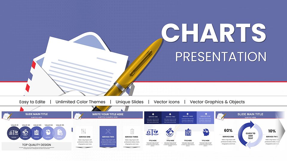
Business Correspondence PowerPoint Charts: Pro PPTX
ID: #PC00957
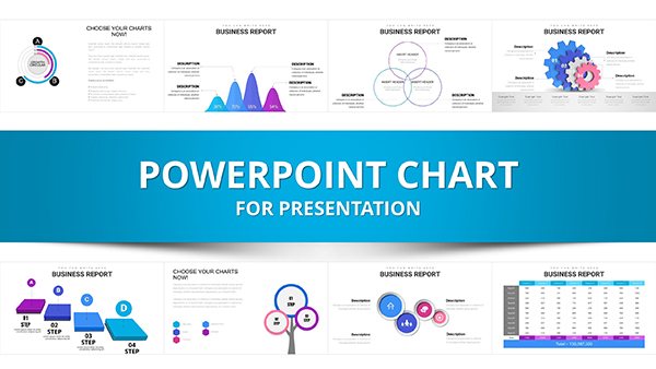
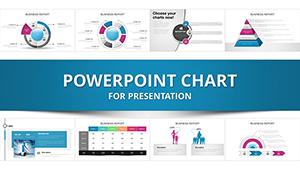
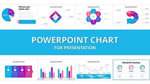
Professional Business Report PowerPoint Charts Template
ID: #PC00938
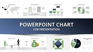
Sustainable Development PowerPoint Charts: Inspire Eco-Innovation
ID: #PC00937
Mastering Technical Analysis: PowerPoint Charts for Informed Trading Decisions
ID: #PC00924
Performance Appraisal PowerPoint Charts Template: Elevate Reviews with Impact
ID: #PC00921
Arrows Branching PowerPoint Charts Template
ID: #PC00846
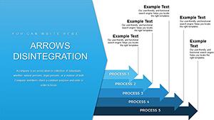
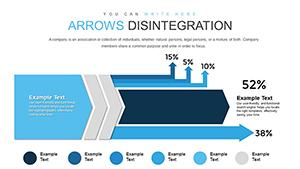
Arrows Disintegration PowerPoint Charts: Break Down Ideas Visually
ID: #PC00839
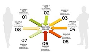
Action PowerPoint Charts Template with Centralized Arrows
ID: #PC00755
Banking PowerPoint Charts Template
ID: #PC00703
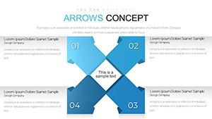
Arrows Flow PowerPoint Charts Template: Streamline Your Ideas Creatively
ID: #PC00643
Price Strategy PowerPoint Charts: Master Pricing Dynamics
ID: #PC00608
Master Class Seminar Training PowerPoint Charts Template
ID: #PC00555
Strategic Planning PowerPoint Charts Template - Download & Customize
ID: #PC00495
Why Our PowerPoint Charts Excel in Finance PowerPoint`s ubiquity meets our precision-engineered charts, featuring error bars for econometric variances - far beyond basic inserts. They serve quants modeling regressions or execs reviewing KPIs.
Practical Use Cases Quarterly Earnings: Column charts with variance highlights.Policy Briefs: Flow diagrams for causal chains.Risk Assessments: Radar plots for multi-factor views. Defaults falter on complexity; ours handle 100+ data points smoothly. Advice: Use sparklines for at-a-glance trends.
Advanced Charting Techniques Evolve a sales funnel into a Sankey for fund flows. Color-code by sentiment for behavioral econ slides.
Best: Validate axes with real units, avoiding misleading scales.
Structuring for Maximum Clarity Title charts descriptively. Annotate outliers. Pair with narratives. Excel integration auto-refreshes. Download charts to experiment.
Standout Chart Examples "Trend Weaver" weaves multi-series lines, great for correlations.
"Budget Beacon" spotlights allocations with treemaps.
"Volatility Vault" secures with candlesticks.
Charting Success Strategies Simplify: One message per visual. Test on projectors. Enhance your deck today.
Frequently Asked Questions