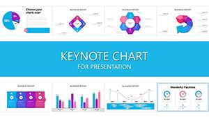
Elevate your economic analyses with specialized Keynote charts templates that transform raw data into compelling visuals. Tailored for economists, analysts, and policymakers, these designs feature advanced graphing tools for indicators like GDP growth, unemployment rates, and trade balances.
From line charts tracking inflation over decades to scatter plots revealing correlation between variables, our templates simplify complex datasets. Include sector-specific icons for industries like manufacturing or services, and leverage Keynote`s animations to highlight key turning points in economic cycles.
Perfect for boardroom briefings or academic papers, these charts ensure precision and persuasion. With drag-and-drop editing, integrate your latest figures seamlessly. Explore our range and make data-driven decisions shine.
Economic reporting often drowns in spreadsheets; our templates rescue it with intuitive, high-fidelity charts that convey narratives at a glance. Unlike basic Keynote charts, which demand manual tweaks, ours are pre-configured with economic scales, trend lines, and forecast overlays, accelerating insight generation.
Analysts praise their role in clarifying macroeconomic shifts, aiding quicker strategic pivots.
Essential Use Cases in Economic Analysis
Policy Briefings: Illustrate fiscal impacts with stacked area charts for budget allocations.
Market Research: Map consumer trends using bubble charts sized by market share.
Academic Lectures: Animate historical data flows for teaching recession patterns.
Corporate Forecasts: Project revenues with combo charts blending lines and bars.
These scenarios span government, academia, and enterprise, promoting data literacy across audiences.
Comparing to Default Chart Options
Default Keynote charts suffice for simple plots but falter on economic nuances like logarithmic scales for exponential growth or dual axes for comparative indices. Our templates embed these, plus color-coded legends for stakeholder types, ensuring reports are both accurate and accessible.
Mastering Economic Data Visualization
Select Appropriate Chart Types: Use heatmaps for regional disparities in income distribution.
Incorporate Annotations: Add callouts for events like policy changes affecting curves.
Ensure Accessibility: Opt for high-contrast palettes and alt-text for charts.
Validate Sources: Footnote data origins to bolster credibility.
These strategies turn static graphs into storytelling powerhouses, influencing decisions profoundly.
Creative Ways to Apply Economic Charts
Beyond reports, use charts in interactive dashboards for real-time monitoring or infographics for social media economic updates. For creativity, layer charts with thematic backgrounds like world maps for global trade visuals, or use 3D effects sparingly for volume representations in commodity markets.
This versatility sparks innovative economic storytelling.
Empower your analyses - download charts today for superior economic insights.
Frequently Asked Questions
Strengthen your economic narratives with precision. Start with a template download now.