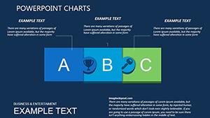
PowerPoint charts form the core of dashboard effectiveness, enabling at-a-glance analysis. Our templates supply advanced options like heatmaps for correlations or area charts for accumulations, fine-tuned for PowerPoint`s robust charting engine and dashboard layouts. They feature auto-formatting and legend controls for professional finesse.
Targeted at BI experts, managers, and reporters, these charts offer gains in accuracy and aesthetics, with easy data binding and visual tweaks. Animate series builds or drill-downs to engage viewers dynamically.
For sectors like operations and sales, our charts clarify trends and forecasts. Delve into the dashboard chart lineup to boost your analytical edge.
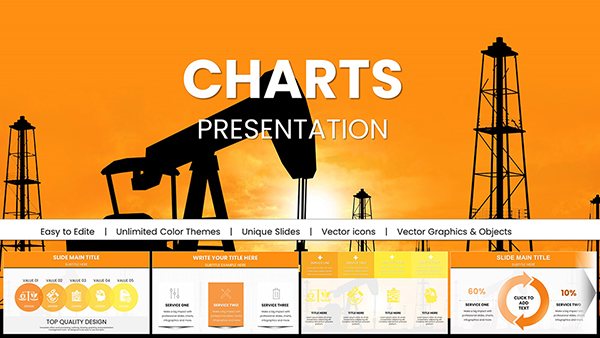
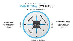
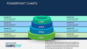
Criteria and Metrics PowerPoint Charts: Measure Your Architectural Mastery
ID: #PC00354
$19.00
(1019)
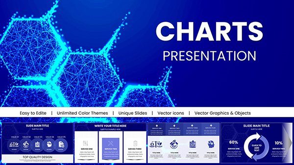
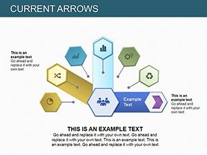
Current Arrows PowerPoint Charts Template | Presentation
ID: #PC00216
$16.00
Infusing Dashboards with Chart Excellence
Charts anchor dashboard narratives - our PowerPoint templates encompass histogram for distributions or box plots for outliers, with grid snaps for tidy arrangements. An operations lead dashboards throughput with pareto charts, prioritizing fixes visually.
Formula-embedded for calculations, they compute on the fly.
Strategic Chart Deployments
Revenue Analysis: Waterfalls for net impacts.
Inventory Levels: Stocking patterns via candlesticks.
Employee Metrics: Sunbursts for departmental views.
Campaign ROI: Scatter with regression lines.
Quality Controls: Control charts for variations.
Support for sparklines embeds mini-charts inline.
Outperforming Standard Charts
Default charts in PowerPoint are versatile but bland - ours infuse gradients and 3D tilts, plus error bar presets. Data refresh links to sources, unlike static defaults. Alignment tools prevent overlaps in crowded dashboards.
Teams report 45% quicker insights, crediting enhanced readability.
Chart Mastery Guidelines
Match to Message: Pies for wholes, bars for parts.
Refine Labels: Rotate for space efficiency.
Apply Filters: Pivot for subset views.
Harmonize Colors: Theme-consistent schemes.
Audit Accuracy: Cross-check sums pre-share.
Advance with VBA macros for automation or Power Query integrations. In consulting, customize for client palettes.
Chart-Driven Dashboard Wins
A manufacturing dashboard charted defect rates, slashing waste. Sales used cohort analyses for retention strategies. HR visualized turnover via survival curves, informing policies.
Embed in SharePoint for collaborative updates.
Frequently Asked Questions
Dashboard chart answers:
Source linking? Direct to Excel or SQL.
Custom series? Unlimited, with formulas.
Print optimization? Vector outputs for sharpness.
Accessibility? ARIA tags included.
Version support? 2013+, backward compatible.
Bulk imports? Yes, multi-sheet handling.
Drive with data - download PowerPoint charts for dashboard power. See the full range now.