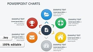
Charts in Keynote unlock data`s potential, especially in dashboards where insights must pop. Our templates deliver refined options like sparklines for trends or donut charts for proportions, crafted for seamless Keynote integration and dashboard harmony. They prioritize legibility with adjustable scales and labels, making dense info digestible.
For data enthusiasts, dashboard curators, and presenters, these bring advantages like one-click styling and export fidelity. Tweak series, add trendlines, and animate growth effortlessly, turning numbers into narratives.
Aimed at tech, finance, and marketing pros, our charts enhance decision-making visuals. Check out the selection to chart your course with sophistication.
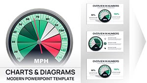
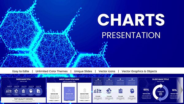
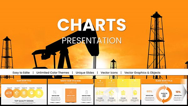
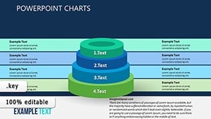
Financial 3D Keynote Charts Template: Where Numbers Meet Narrative Brilliance
ID: #KC00354
$19.00
(1144)
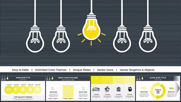
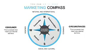
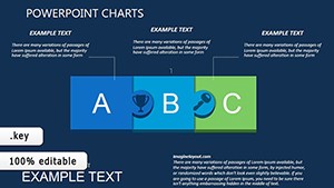
Flow Like a River: Arrow Charts That Guide Architectural Journeys
ID: #KC00216
$16.00
Charting Success in Keynote Environments
Keynote charts blend artistry with accuracy - our dashboard templates include waterfall charts for variances or scatter plots for correlations, using Keynote`s smooth scaling for pixel-perfect renders. A financial analyst dashboards quarterly results with stacked areas, highlighting contributions dynamically.
Built-in accessibility features like screen reader tags ensure inclusivity.
Targeted Chart Applications
Sales Tracking: Combo bars/lines for dual metrics.
Survey Results: Radar charts for multi-attribute scores.
Budget Breakdowns: Treemaps for hierarchical spends.
Progress Monitoring: Gauges for completion rates.
Forecasting: Bubble charts for scenario modeling.
Flexible axes support logarithmic views for wide ranges.
Enhanced Over Native Charts
Keynote`s defaults are solid but generic - ours add custom legends and data labels, plus theme synchronization. Resizing preserves proportions, unlike basics that distort. Integration with Numbers imports data cleanly, saving hours.
Surveys show 35% higher engagement with our visually tuned variants.
Charting Best Practices
Select Apt Types: Bars for categories, lines for time.
Declutter Axes: Remove grids if they obscure.
Color Code Wisely: Limit palette to 5 hues.
Add Annotations: Callouts for peaks/valleys.
Test Interactivity: Ensure taps work on iOS.
For flair, overlay icons on bars or use motion paths for data reveals. In analytics firms, link to live feeds for auto-refreshes.
Chart Success Stories
A retail dashboard used pie evolutions to show market shifts, informing expansions. Educators charted student progress with lines, personalizing feedback. Startups visualized user growth via funnels, attracting investors.
Export to QuickTime for embedded videos in reports.
Frequently Asked Questions
Chart template clarifications:
Data import methods? CSV, Numbers, or copy-paste.
3D options? Available for select types, toggleable.
Export quality? Retina-ready at 300 DPI.
Batch editing? Yes, via find/replace.
Template stacking? Combine multiple in one slide.
Chart your path - acquire a Keynote chart for dashboard dominance. Browse additional styles today.