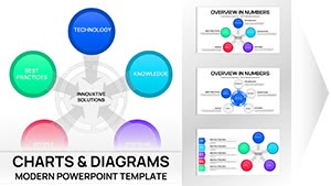
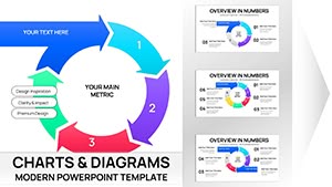
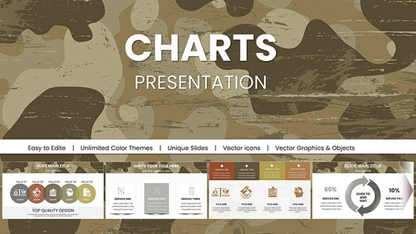
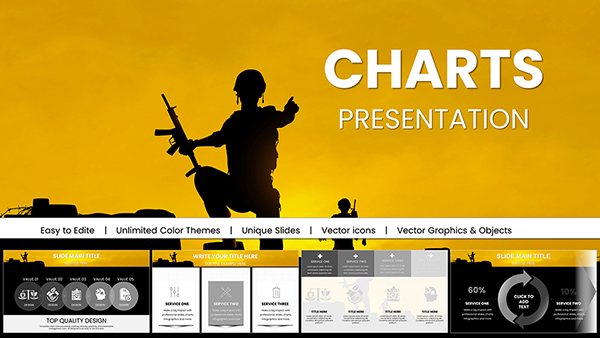
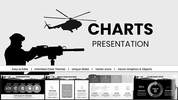
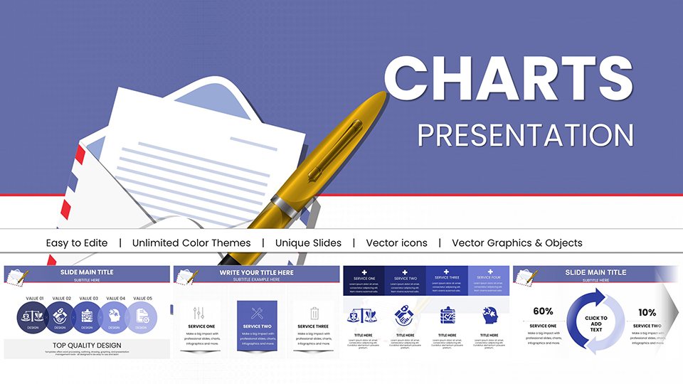
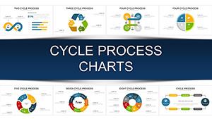
Visualize circular processes, recurring workflows, and continuous improvement cycles with professionally designed cycle diagram templates. Perfect for illustrating business processes, project lifecycles, strategic planning frameworks, and any concept that involves repetition or cyclical progression.
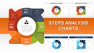
Our cycle diagram collection includes circular flow charts, process wheels, recurring stage diagrams, and continuous loop visualizations in various styles - from minimalist line designs to bold, colorful segmented circles. Each template is fully customizable for PowerPoint and Google Slides, allowing you to adjust the number of stages, modify colors, and tailor text to your specific process.
Ideal for business consultants, project managers, educators, quality assurance professionals, and strategic planners who need to communicate iterative processes and cyclical concepts clearly. Explore all cycle diagram templates and find the perfect visualization for your repeating processes.


Cycle diagrams represent processes that repeat in a continuous loop with no definitive beginning or end. Unlike linear flowcharts that move from start to finish, cycle diagrams emphasize the ongoing, iterative nature of processes - making them essential for representing quality improvement methodologies, product development cycles, customer journey mapping, and natural phenomena.
The circular format immediately communicates continuity and interconnection. When audiences see information arranged in a cycle, they instinctively understand that the process repeats, each stage feeds into the next, and continuous improvement is built into the system. This makes cycle diagrams powerful tools for organizational change management and process optimization presentations.
Basic 3-to-6 stage cycle diagrams work best for straightforward repeating processes. These include the classic circular arrow design where each segment represents one phase. Use these for Plan-Do-Check-Act cycles, basic product lifecycles, simple feedback loops, or any process with clear, distinct stages that repeat in sequence.
Segmented or pie-style cycle diagrams divide a circle into colored sections, each representing a phase with specific emphasis or time allocation. These visualizations work exceptionally well for showing proportional relationships within a cycle - such as how much time, resources, or focus each stage requires. Marketing teams use these for customer lifecycle value analysis and resource allocation planning.
Concentric circle designs show nested or hierarchical cycles, perfect for illustrating how smaller processes fit within larger organizational cycles. For example, showing how daily operations cycles nest within weekly review cycles, which nest within monthly strategic cycles. These multi-layer diagrams excel at demonstrating systems thinking and organizational alignment.
Templates featuring prominent directional arrows emphasize movement and progression through stages. The arrow weight and style communicate flow intensity - thick arrows suggest strong causal relationships while thinner arrows indicate gentler transitions. Use directional cycles when the sequence order and momentum matter most to your message.
Figure-eight or infinity symbol cycles represent two interconnected processes that continuously feed each other. Common in DevOps methodologies, agile development frameworks, and feedback-driven improvement systems. These diagrams visually communicate bidirectional influence and perpetual iteration.
Project managers use cycle diagrams extensively to illustrate agile sprints, SCRUM frameworks, and iterative development processes. These visualizations help teams understand that each sprint or iteration builds upon previous learning, with continuous improvement embedded in the methodology itself. Retrospectives, planning, execution, and review phases all connect in an ongoing cycle.
The PDCA cycle (Plan-Do-Check-Act), also known as the Deming Cycle, is fundamental to quality management and appears in countless presentations about continuous improvement, Six Sigma, and lean manufacturing. Cycle diagrams make these abstract concepts tangible, showing how planning leads to action, which generates data for checking, which informs adjustments, which feed back into planning.
Marketing professionals visualize customer lifecycle stages using cycle diagrams - awareness, consideration, purchase, retention, and advocacy. The circular format emphasizes that retained customers can become advocates who generate awareness for new customers, creating a self-sustaining growth engine. This visualization helps organizations understand that customer relationships don't end at purchase.
Organizations use cycle diagrams to represent annual strategic planning processes - environmental scanning, strategy formulation, implementation, monitoring, and evaluation. The cyclical view reinforces that strategy isn't a one-time event but an ongoing process requiring regular reassessment and adjustment based on market changes.
Product teams employ cycle diagrams to show idea generation, prototype development, testing, launch, and feedback collection stages. The circular arrangement emphasizes that market feedback from launched products informs the next generation of ideas, creating continuous innovation rather than discrete product releases.
Match complexity to audience sophistication. Executive audiences prefer simple 3-4 stage cycles with high-level descriptions, while technical teams can process more detailed 6-8 stage diagrams with supporting annotations.
Use color strategically to group related stages. If your cycle includes stages that fall into broader categories (like "planning phases" vs. "execution phases"), use color families to show these relationships. This adds a layer of meaning without cluttering the diagram.
Maintain consistent directional flow. Standardize on clockwise progression unless you have compelling reasons to deviate. Clockwise cycles feel natural and intuitive to most audiences because they mirror clock movement and Western reading patterns.
Include entry and emphasis points. Even though cycles theoretically have no beginning, your audience needs a visual starting point. Use color contrast, size variation, or position to indicate where viewers should begin reading the diagram.
Balance text density. Each stage should have a clear label and brief description (1-2 lines maximum). Detailed explanations belong in your verbal presentation or supporting text, not cluttering the cycle diagram itself.
Consider adding a center element. The circle's center is prime real estate for emphasizing the core principle, goal, or value that all stages serve. For example, "Customer Satisfaction" at the center of a service improvement cycle reinforces that every stage ultimately serves that purpose.
Medical professionals use cycle diagrams to represent patient care pathways, clinical trial phases, disease progression and treatment cycles, and evidence-based practice implementation. These visualizations help multidisciplinary teams understand treatment continuity and how interventions at one stage impact outcomes throughout the patient journey.
Educators employ cycle diagrams to illustrate learning cycles, curriculum development processes, assessment feedback loops, and experiential learning models. Kolb's Experiential Learning Cycle - concrete experience, reflective observation, abstract conceptualization, and active experimentation - is frequently visualized using cycle diagrams.
Environmental scientists and sustainability consultants use cycles to represent natural processes (water cycle, nutrient cycles, carbon cycle) and circular economy principles. These diagrams powerfully communicate resource regeneration, waste minimization, and closed-loop systems that eliminate the concept of "waste" entirely.
Technology teams leverage cycle diagrams for DevOps pipelines, continuous integration/continuous deployment (CI/CD) workflows, incident management processes, and software development life cycles (SDLC). These visualizations help stakeholders understand that modern software development is iterative rather than waterfall-based.
HR professionals visualize employee lifecycle management, performance review cycles, talent acquisition processes, and learning and development pathways. Cycle diagrams emphasize that employee engagement is continuous, requiring consistent attention at every career stage rather than isolated interventions.
Overcrowding stages. Trying to fit 10+ stages into a single cycle diagram creates visual chaos. If your process has many steps, consider grouping them into higher-level categories or using multiple connected cycles to show sub-processes.
Inconsistent arrow styles. Mixing solid arrows, dashed arrows, and curved arrows without clear meaning confuses audiences. Establish arrow conventions and stick to them throughout your presentation.
Neglecting the cyclical aspect. If the last stage doesn't clearly connect back to the first, your diagram looks like a circular arrangement rather than a true cycle. Emphasize the connection between the final and initial stages to complete the loop visually.
Forgetting to explain what triggers cycle progression. Audiences often wonder what causes movement from one stage to the next. Include brief transition labels or use your verbal presentation to clarify what drives progression through the cycle.
Our cycle diagram templates are designed for effortless brand alignment. Apply your corporate color palette by modifying PowerPoint's theme colors - the entire diagram updates automatically. This ensures visual consistency across your presentation deck without manually recoloring each element.
Adjust the number of cycle stages by selecting diagram elements and using PowerPoint's SmartArt tools or manually duplicating/removing segments. Most templates accommodate 3-8 stages with minimal layout adjustments.
Modify typography to match your brand guidelines. Templates inherit font selections from your presentation's master slides, ensuring typographic harmony. If specific fonts are required, simply update the master slide and all diagrams reflect the change.
Add your company logo or icons to the center of cycle diagrams for brand reinforcement. The center space is perfect for subtle branding that doesn't overpower the informational content.
Ready to communicate cyclical processes with clarity and impact? Download professional cycle diagram templates and transform complex iterative processes into compelling visual narratives that audiences immediately understand.
Copyright © 2009-2026 ImagineLayout All rights reserved.