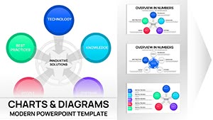
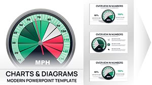
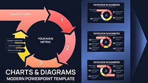
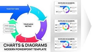
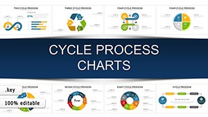
Cycle charts beautifully illustrate repeating processes continuous improvement and interconnected stages. Our extensive collection of over 150 Keynote cycle chart templates offers circular designs that guide the eye naturally through each phase.
These professional animated templates feature smooth arrows balanced segments and modern color gradients for maximum clarity.
Completely customizable they adapt to any number of stages and any industry story.
Bring flow and elegance to your presentations with ready-to-use cycle visuals.
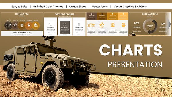
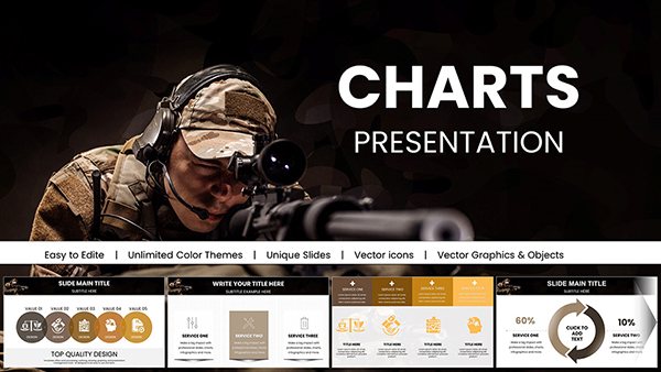
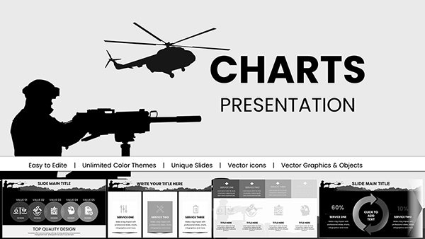
Military Vehicle Keynote Charts Presentation: Elevate Your Defense Strategies
ID: #KC01008
$20.00
(1173)
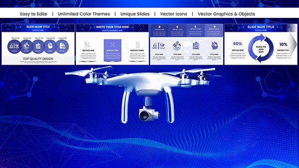
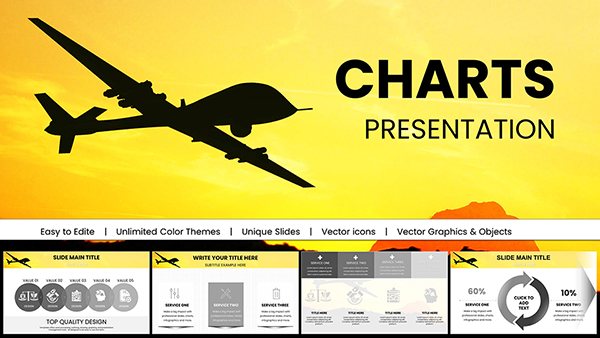
Military Technology Drones Keynote Charts for Presentation
ID: #KC00997
$18.00
(520)
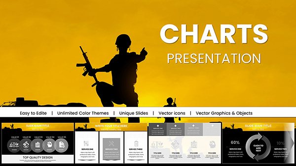
Armed Forces Keynote Charts for Military Presentation
ID: #KC00995
$18.00
(444)
Military Pay Keynote Charts Template
ID: #KC00994
$18.00
(966)
Armed Forces PowerPoint Charts for Military Presentation
ID: #KC00993
$16.00
(1062)
Army Pay Keynote Charts for Military Presentation
ID: #KC00992
$18.00
(605)
Business Correspondence Keynote Charts Template
ID: #KC00957
$20.00
(466)
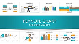
Professional Business Report Keynote Charts
ID: #KC00938
$25.00
(532)
Sustainable Development Keynote Charts: Empower Your Eco-Presentations
ID: #KC00937
$25.00
(88)
Reclaim Your Day: Boost Your Productivity with Keynote Charts Templates
ID: #KC00933
$24.00
(936)
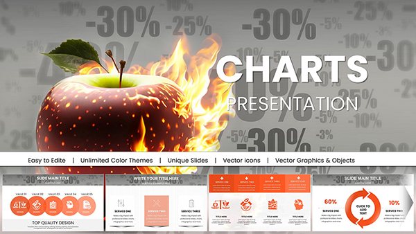
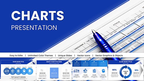
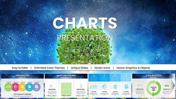
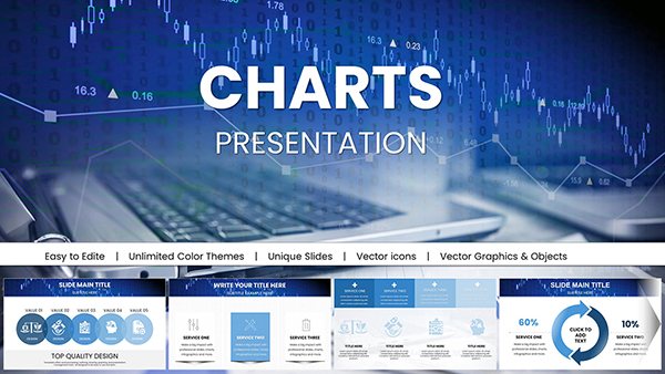
Cycle Process Keynote Charts - Instant Download | ImagineLayout
ID: #KC00922
$20.00
(803)
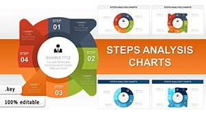
Steps Analysis Keynote Charts: Project Flows
ID: #KC00918
$18.00
(108)
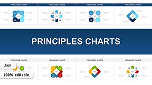
Principles Keynote Charts: Visualize Business Fundamentals with Flair
ID: #KC00917
$16.00
Why Cycle Charts Captivate Audiences
Circular designs mirror natural processes and create a sense of completeness. They keep viewers focused as the eye follows the logical flow around the diagram.
Our templates enhance this with subtle animations that move through stages sequentially.
Everyday Use Cases
Business Processes
Map sales cycles or PDCA improvement loops.
Product Development
Show iterative design and feedback stages.
Education
Illustrate water carbon or life cycles.
Marketing
Present customer journey loops.
Superior Features in Our Templates
Perfectly symmetrical circular layouts
Directional arrows with animation options
Flexible segment counts from 3 to 12
Modern gradient and flat style variations
Integrated icon sets
Design Tips for Cycle Charts
Use even spacing between segments. Choose colors that progress logically. Keep text concise. Animate in clockwise direction. Add a central icon or title for focus.
Our templates already implement these best practices.
Ready to show processes in motion? Browse our cycle chart collection and download now.
Frequently Asked Questions
How many stages can cycle templates support?
Most templates handle 3 to 10 stages easily with editable segments.
Are arrows animated?
Yes. Many include flowing arrow animations to show direction.
Can I change the direction of the cycle?
Absolutely. All elements are fully editable.
Are free cycle templates available?
Yes. Plenty of free designs plus premium collections.