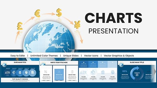
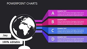
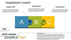
Navigate the world of finance with our currency chart templates crafted for Keynote. Suited for analysts, traders, and economists, these visuals transform raw exchange data into compelling stories of market movements, forecasts, and opportunities.
From line graphs tracking forex fluctuations to bar comparisons of crypto values, our designs incorporate real-time placeholders, trend lines, and annotation tools that simplify complex datasets. Adjust scales, currencies, and timeframes with intuitive controls, ensuring accuracy in every presentation.
Geared toward decision-makers in banking, investment firms, and international trade, these templates foster clarity and confidence. Their responsive layouts adapt to widescreen or standard formats, preserving detail across platforms.
Delve into our financial charting arsenal and make data your ally. Download selections to illuminate economic narratives today.


Currency charts are indispensable in high-stakes financial dialogues. Investment advisors employ them in client portfolios, overlaying historical trends with projected yields to justify recommendations. Traders brief teams on volatility patterns, using candlestick variants to pinpoint entry points.
Corporate finance departments report quarterly exchanges, stacking multi-currency impacts for board overviews. Educational modules in business schools simulate market scenarios, animating rate shifts for immersive learning.
Travel agencies forecast budget impacts from fluctuations, while researchers chart inflation correlations across economies.
Basic Excel exports often appear pixelated or inflexible in Keynote, lacking seamless animations; our templates use native vectors for crisp scaling and morph transitions that reveal data layers dynamically. Generic tools miss currency symbols and decimal alignments, leading to errors - ours auto-format to ISO standards.
With built-in formula links, updates propagate instantly, outpacing manual recalculations in free versions. Accessibility features like alt-text for axes ensure compliance, broadening reach.
Highlights encompass dual-axis setups for cross-asset views and exportable data tables. Guidelines: Use logarithmic scales for volatile pairs, color-code majors (e.g., green for USD), and cap series to three for clarity.
Innovative uses: Animate blockchain transactions or ESG impacts on fiat values, blending finance with emerging trends.
These methods sharpen analytical edge. Survey charts and download to currency-proof your decks.
Yes, over 150 with auto-conversion tools.
Integrates with APIs for live updates during presentations.
Lines, bars, pies, and candlesticks tailored for finance.
Fully, with drag-to-adjust and font matching.
To PDF, image, or Excel for versatile sharing.
Track and triumph with currency charts - download your toolkit today.
Copyright © 2009-2026 ImagineLayout All rights reserved.