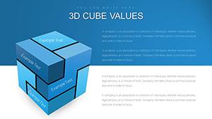
Cube charts in PowerPoint offer a three-dimensional twist on traditional graphing, stacking data layers for deeper insights at a glance. Perfect for financial summaries, product comparisons, or performance metrics, these templates make abstract numbers tangible and engaging. Geared toward analysts, managers, and presenters seeking impact, they combine geometry with clarity.
Envision cubes rising to represent quarterly sales or segment breakdowns, rotating to reveal facets effortlessly. Our collection features isometric projections and customizable stacks, ensuring compatibility with your datasets. From boardroom dashboards to academic overviews, they elevate mundane charts into architectural wonders.
Delve into our cube chart lineup and choose structures that match your data story. With drag-and-drop simplicity, transform spreadsheets into standout visuals. Get started now and build presentations that stand tall.
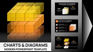
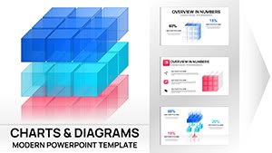


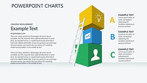
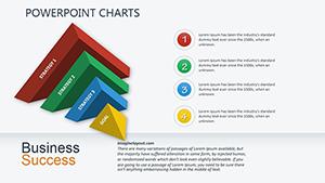
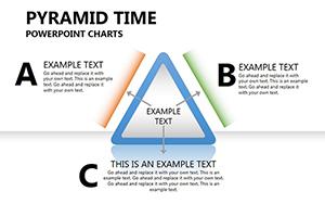
Cube charts transcend flat graphs by adding depth, ideal for multifaceted data like SWOT analyses or inventory tiers. Their stacked form aids in comparing volumes intuitively, often increasing interpretive speed for viewers. In high-stakes environments, they convey complexity without confusion, a staple for quarterly reviews or strategy sessions.
Finance teams stack revenue streams by cube height, while HR visualizes diversity metrics across dimensions. Marketers dissect campaign ROI with colored facets, each face a channel`s contribution.
PowerPoint`s 3D rotation tools amplify their interactivity, letting audiences explore angles.
Bar charts flatten perspectives, but cubes add relational depth, showing intersections that lines miss. Defaults in PowerPoint lack cube precision, often warping on resize, whereas our templates maintain proportions flawlessly. Customization is a breeze - tweak heights or hues without rebuilding.
They surpass pies in scalability for large datasets, avoiding slice clutter. The geometric appeal draws eyes, making dense info approachable.
Implement these for charts that command attention.
Go beyond basics: Architects model building volumes with cubes, educators simulate molecular structures. A retail chain stacked store performances into a mega-cube, revealing underperformers at core - leading to targeted revamps.
Fuse with timelines for evolution views or scatter cubes for spatial correlations. Our variants from single stacks to grids suit solo or ensemble data.
Assemble your next chart from our selection.
Balance is key: Limit stacks to five for readability, aligning with PowerPoint`s grid. Employ shadows for realism, testing under various lights. Accessibility through alt descriptions narrates cube contents verbally.
Update dynamically with linked Excel for live refreshes, keeping decks evergreen.
Construct superior visuals. Acquire cube chart templates at once and dimension your data dynamically.
Copyright © 2009-2026 ImagineLayout All rights reserved.