Cube charts for Keynote introduce volumetric graphing, where data cubes interlock to unveil multi-angle perspectives. Suited for strategy sessions, research findings, or metric breakdowns, they make layered information pop with geometric grace. Aimed at strategists, researchers, and speakers craving sophistication, these tools redefine chart dynamics.
Picture assemblies of cubes escalating to depict growth trajectories or segment hierarchies, manipulable for on-stage interactions. Our Keynote-optimized templates boast precise alignments and theme syncing, fitting seamlessly into your slide flow. Ideal for turning voluminous datasets into sculptural stories that captivate.
Navigate our cube chart offerings and erect the framework for your data tale. With intuitive reshaping, elevate routine reports to remarkable exhibits. Initiate your build today and stack success.
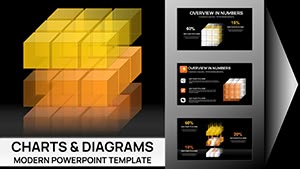
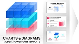


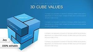


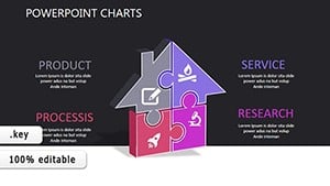
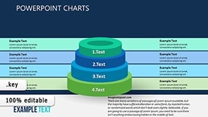
In Keynote, cube charts embody complexity through form, excelling at portraying hierarchies or comparisons in volumes that bars can`t match. Their appeal lies in interactivity - rotate to expose hidden layers - boosting engagement in workshops or keynotes. For data-driven talks, they distill intricacies into elegant edifices.
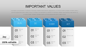
Consultants erect risk matrices as cubes, consultants layer client portfolios by facet. Academics model ecosystem balances, with species interactions as stacked units.
Keynote`s magic move enhances cube transitions, creating fluid evolutions between views.
Line graphs linearize what cubes volumetricize, missing spatial ties our templates capture. Keynote defaults offer basic 3D but falter in customization; ours provide modular pieces for bespoke assemblies. Faster than manual modeling, they preserve aspect ratios across edits.
Versus scatters, cubes consolidate clusters, clarifying overlaps. The tactile illusion invites closer inspection, enriching discourse.
Adopt these for charts that construct conviction.
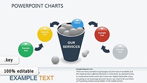
Venture into fusing cubes with narratives: Storytellers stack plot arcs, designers model UI layers. A biotech firm cubed trial phases, exposing efficacy gradients - sparking partnerships.
Hybridize with orbits for cyclical data or explode views for dissections. From monolithic monoliths to lattice lattices, our spectrum spans scales.
Engineer your edition from our essentials.
Precision prevails: Snap to guides for alignment, using Keynote`s depth controls for shadow play. Integrate hyperlinks on cubes for drill-downs. For broad access, embed audio cues describing structures.
Automate with scripts for recurring updates, sustaining sharpness.
Assemble awe-inspiring analytics. Grab cube chart templates promptly and fabricate facets of brilliance.
Copyright © 2009-2026 ImagineLayout All rights reserved.