Control charts help you monitor processes identify variations and maintain quality standards. Our specialized collection of Keynote control chart templates makes statistical tracking visually clear and professional.
These ready-to-use animated templates include upper and lower limits center lines and data points designed for easy interpretation.
Fully editable to match your data and branding they turn complex process metrics into accessible slides for any audience.
Ideal for operations manufacturing and project teams aiming for excellence in.
Timeline Maker Keynote Charts: Sequence Your Architectural Masterpieces
ID: #KC00497
$21.00
(132)
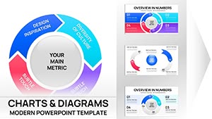
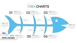
Marketing Charts Keynote Template
ID: #KC00345
$19.00
Power of Control Charts in Presentations
Control charts reveal whether a process is stable or experiencing special-cause variation. Clear visual boundaries make anomalies obvious helping teams act quickly.
Our templates simplify this powerful tool with clean designs and built-in guidance.
Common Applications
Quality Assurance
Track defect rates against control limits in manufacturing.
Project Management
Monitor schedule variance and resource utilization.
Healthcare
Display patient wait times or treatment outcomes.
Operations
Watch key performance indicators over time.
Advantages of Premium Templates
Pre-drawn control limits and center lines
Color-coded variation indicators
Smooth data point animations
Multiple chart variations X-bar R charts etc.
Clean minimalist aesthetics
Tips for Effective Control Charts
Update data regularly. Highlight out-of-control points. Keep scales consistent. Use subtle colors for limits. Explain rules for interpretation.
Our templates incorporate these standards for immediate professional results.
Need precise process visuals? Discover our control chart templates and download today.
Frequently Asked Questions
What are control charts used for?
Control charts monitor process stability over time distinguishing common-cause from special-cause variation.
Do templates include control limit calculations?
Limits are pre-set but fully editable so you can input your own calculations.
Are different control chart types available?
Yes. We include X-bar R p np and other common variations.
Are free control chart templates offered?
Yes. Several free designs are available with premium options for more variety.