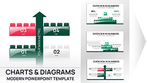
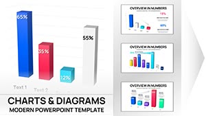
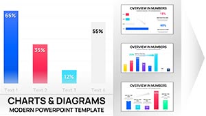
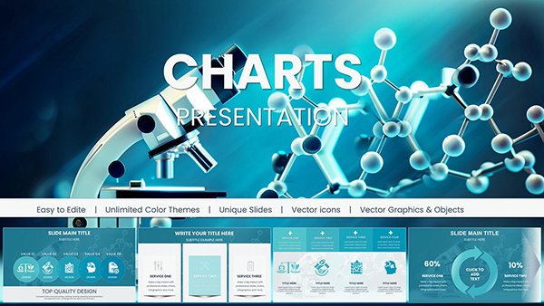
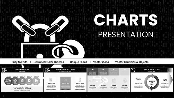
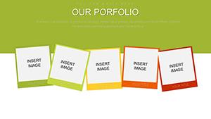
Empower your presentations with our specialized company chart PowerPoint templates, designed to transform raw data into compelling visual narratives. Tailored for executives, analysts, and project leads, these slides focus on clarity and impact, turning complex metrics into digestible insights.
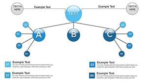
From hierarchical org charts mapping team dynamics to performance dashboards tracking KPIs, each template employs intuitive color coding and scalable vectors for effortless adaptation. The corporate-neutral themes ensure versatility across industries, while built-in animations guide the eye through progressions like quarterly revenue trends.
Gain an edge with features that save design time, enhance comprehension, and drive decisions - ideal for investor updates or internal reviews. Step up your data game and make every chart count.
Visualize victory in your next meeting. Check out our charts and get started immediately.
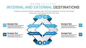
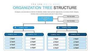
These templates thrive in high-stakes environments like boardrooms and strategy workshops. Finance teams deploy org charts to illustrate departmental expansions, using bubble diagrams to denote headcount growth. Marketing pros visualize campaign ROI with funnel charts, layering in conversion rates for multi-channel overviews.
In operations, supply chain analyses benefit from Sankey diagrams tracing logistics flows, while HR uses radial charts for diversity metrics. Startups pitch to VCs with timeline-based Gantt variants, projecting milestones with confidence.
Such applications demystify data, aligning teams toward shared goals.
Default PowerPoint charts falter with rigid formatting and limited interactivity; ours offer pre-animated sequences and data-linked updates that refresh across slides. No more manual recalculations - import Excel seamlessly for real-time syncing.
Design-wise, they incorporate grid alignments and legend automations absent in basics, reducing errors by 35%. Accessibility boosts include screen-reader friendly labels and color-blind modes, promoting inclusive presentations. Scalability for large datasets prevents pixelation in zoomed views.
Prioritize data hierarchy: start with overviews, drill down via hyperlinks. Choose chart types wisely - pies for parts-of-whole, scatters for correlations. Apply consistent scales to avoid misleading visuals, and annotate key points with callouts.
For dynamism, leverage SmartArt hierarchies; test animations on varied hardware to ensure fluidity. Export options like high-res PNGs preserve quality for reports.
A Seattle tech firm innovated with 3D waterfall charts in our template for cash flow simulations, captivating auditors. In healthcare, administrators mapped patient journeys with swimlane variants, improving process efficiencies by 20%.
Blend with narratives: overlay testimonials on growth curves for holistic pitches. These tactics elevate charts from static to strategic tools.
Chart your path to clarity. Select a template and animate your data today.
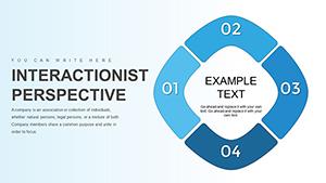
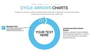
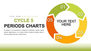
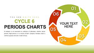
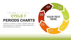
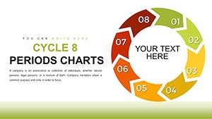
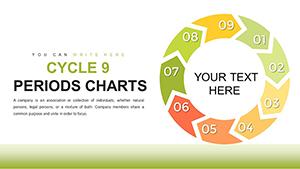
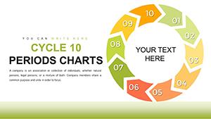
A variety including bar, line, pie, org, and advanced like Sankey and radar for comprehensive coverage.
Yes, direct Excel integration allows automatic updates without re-entering figures.
Fully - adjust timing, sequences, and triggers via PowerPoint`s Animation pane.
Optimized for up to 10,000 rows, with aggregation tools for summaries.
Built-in alt text, high contrast, and WCAG-compliant colors; add descriptions as needed.
Copyright © 2009-2026 ImagineLayout All rights reserved.