Interactionist Perspective Cycle PowerPoint Template: Illuminate Social Dynamics


Type: PowerPoint Charts template
Category: Cycle
Sources Available: .pptx
Product ID: PC00814
Template incl.: 28 editable slides
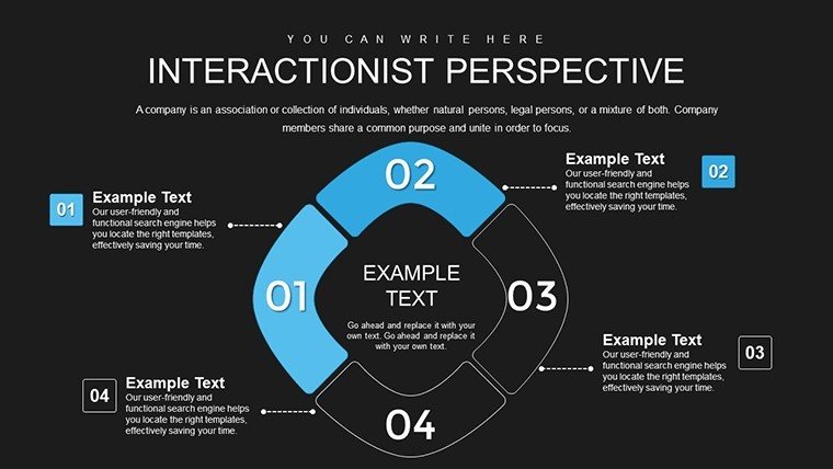
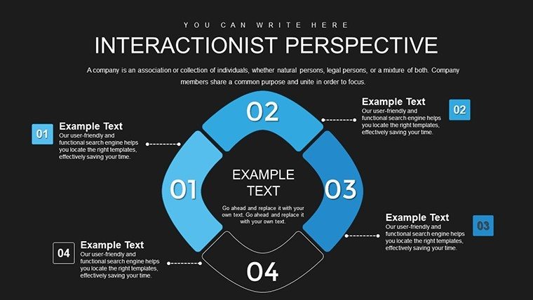
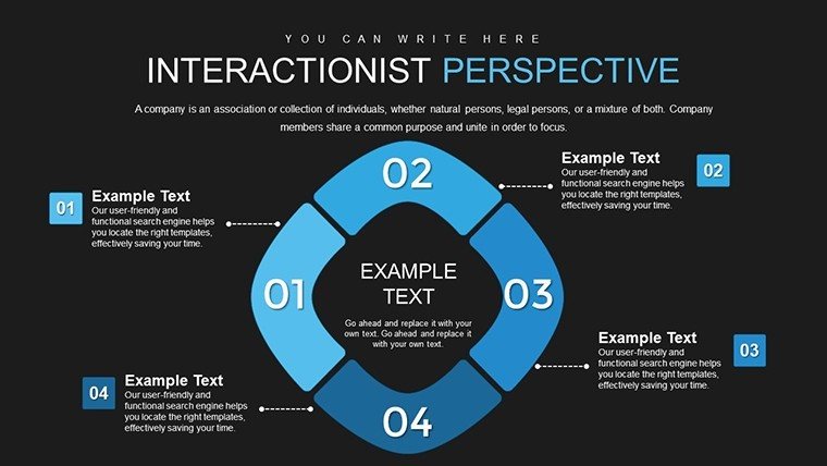
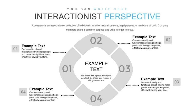
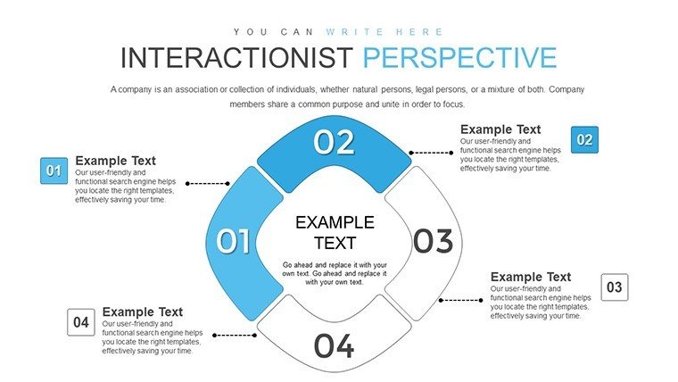
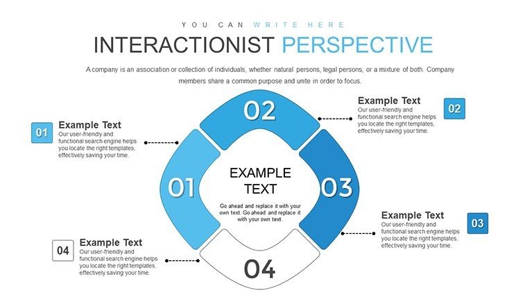
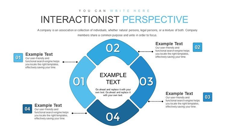
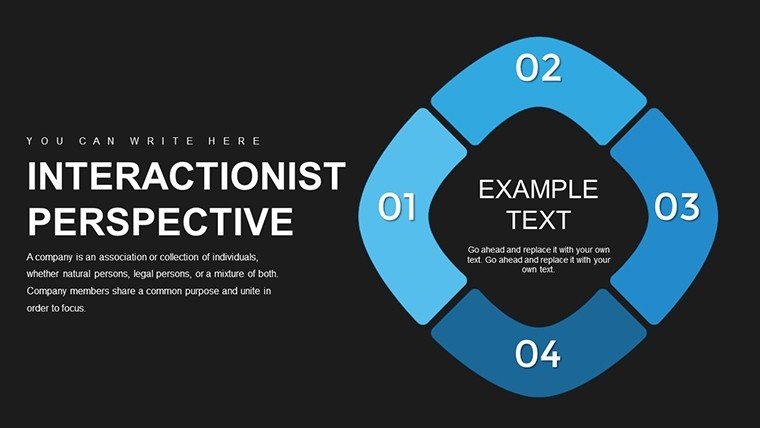
Sociology thrives on understanding the intricate web of human interactions, and our Interactionist Perspective Cycle PowerPoint Template provides the perfect canvas. With 28 editable slides, it visually captures cycles of social norms, roles, power, and status, making abstract theories tangible. Aimed at sociologists, researchers, and educators, this tool simplifies complex concepts like symbolic interactionism, drawing from thinkers like Goffman and Blumer. Envision presenting on workplace dynamics where cycles show how roles evolve through daily exchanges - your audience gains deeper insights into societal structures. This template bridges theory and application, fostering discussions that reveal how everyday interactions shape identities and institutions, from schools to media landscapes.
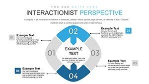
Delving into the Cycle: Visualizing Interactionist Theory
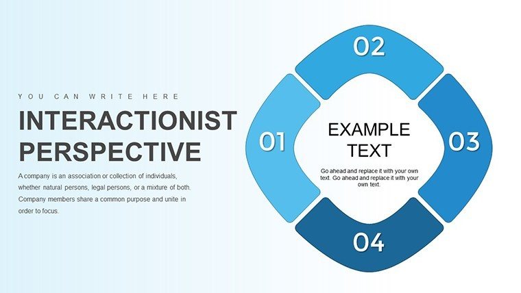
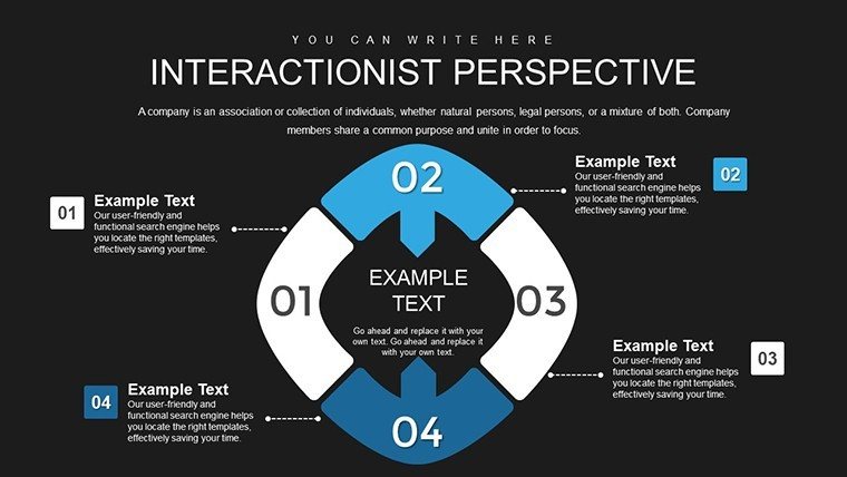
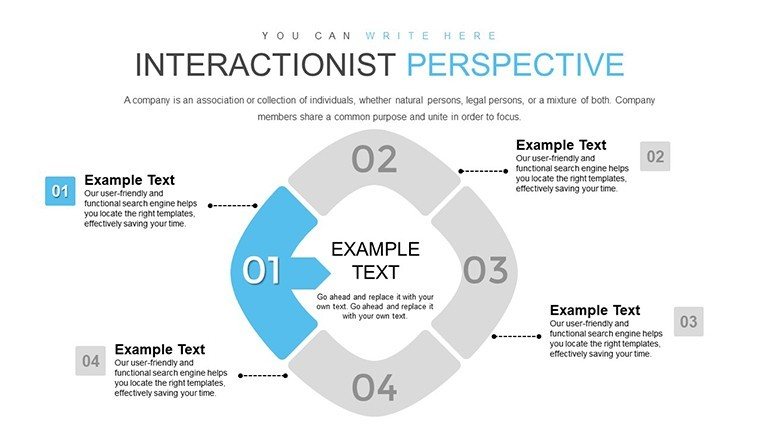
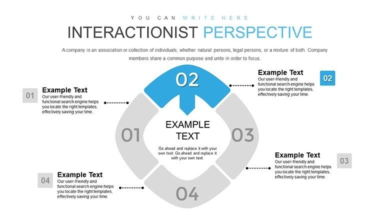
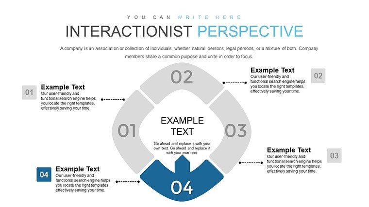
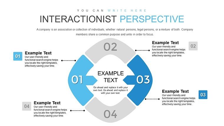
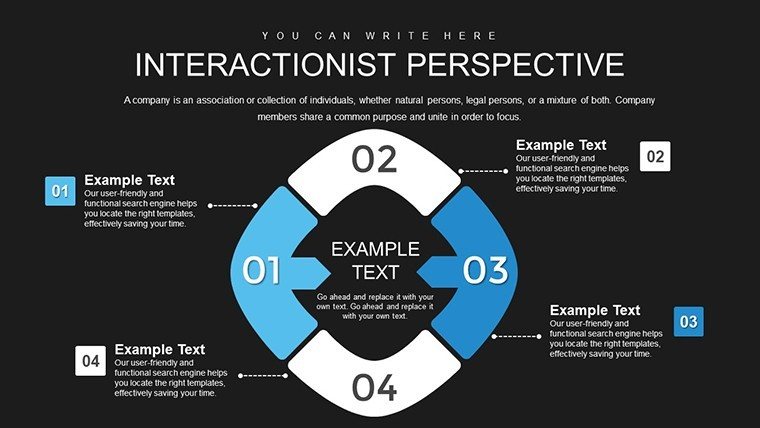
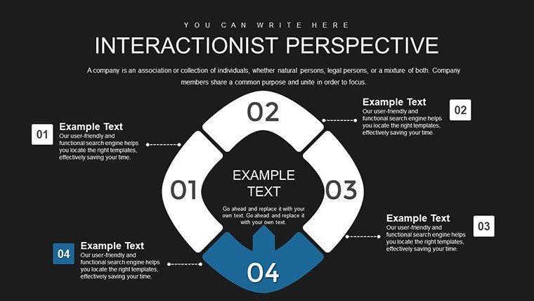
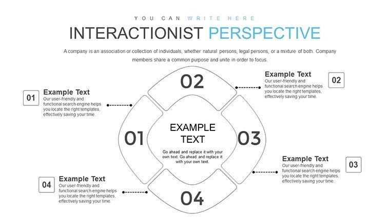
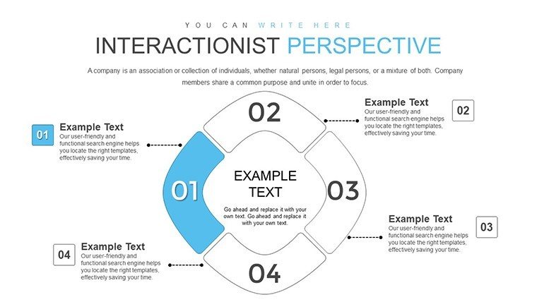
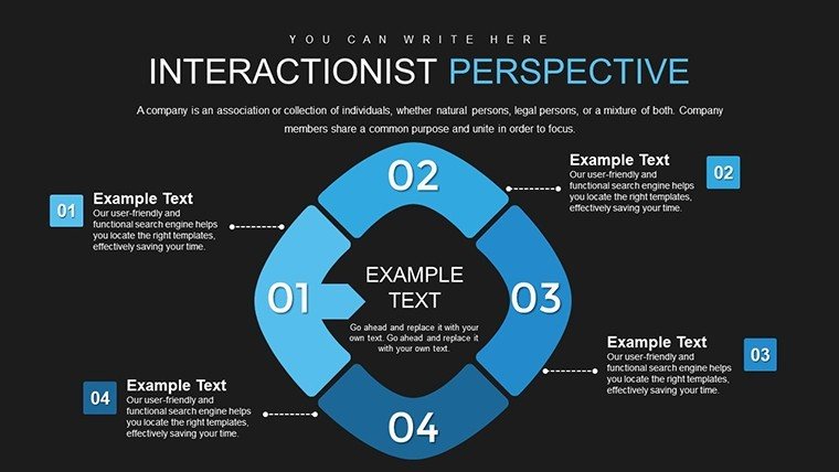
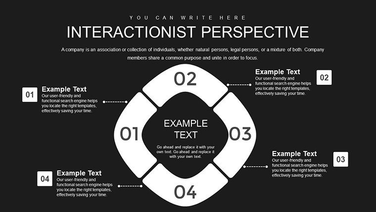
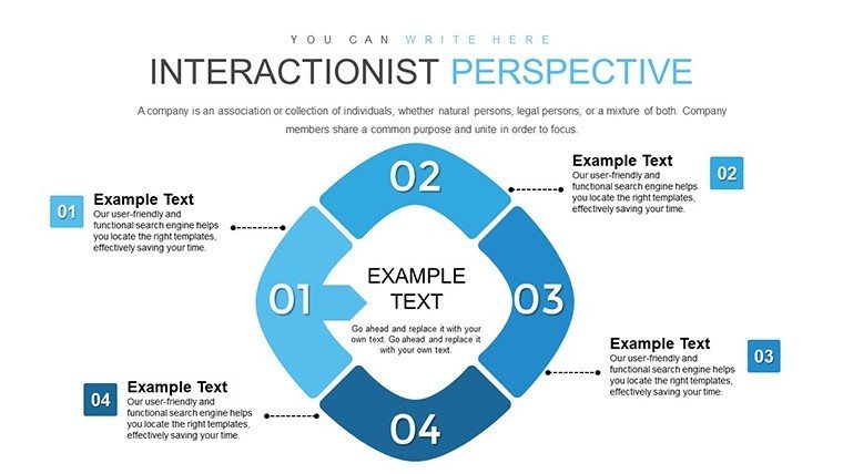
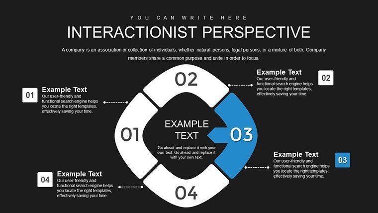
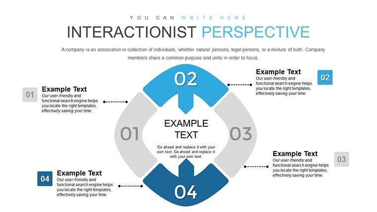
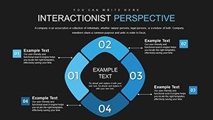
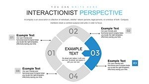
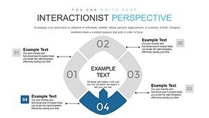
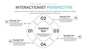
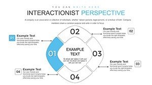
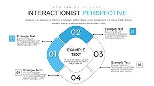
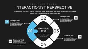
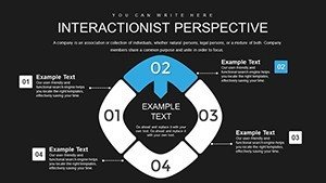
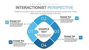
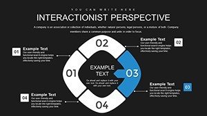
The cycle format embodies the ongoing nature of social interactions, where one exchange feeds into the next. Slides feature looping diagrams to represent feedback loops in norms and behaviors, with options to highlight elements like power imbalances. Customize by adding annotations from studies, such as Mead's self-development cycles, or integrate data on social media's role in identity formation.
Essential Features for Sociological Depth
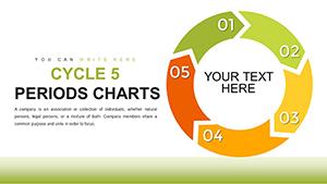
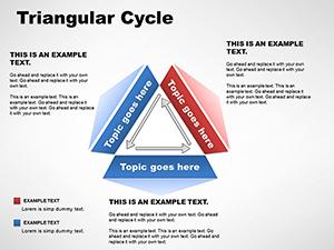
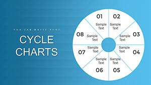
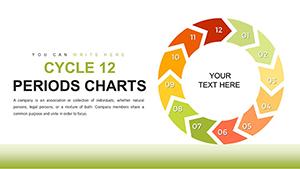
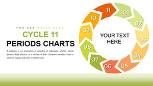
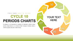
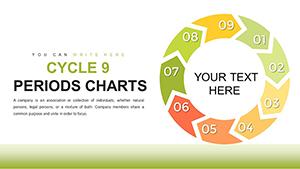
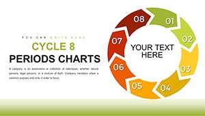
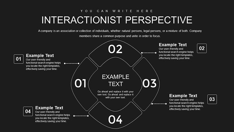
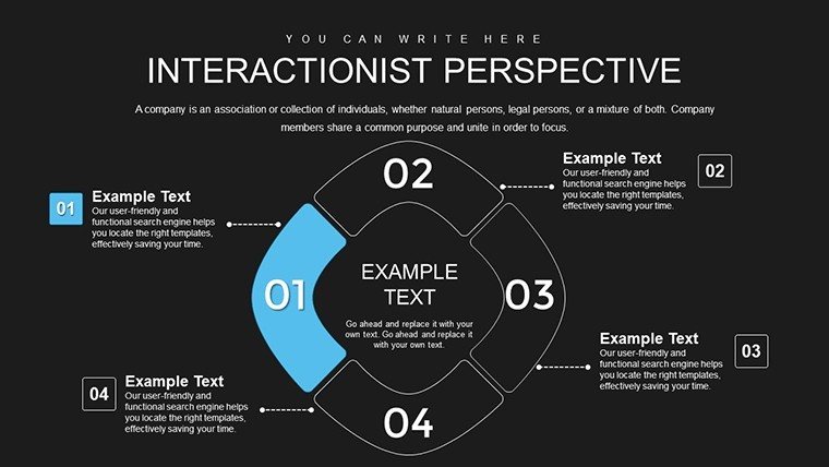
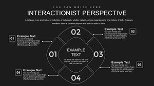
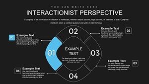
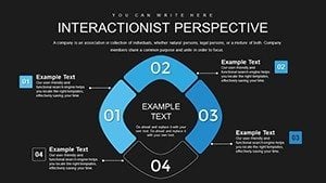
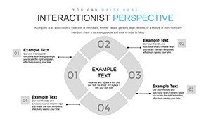
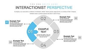
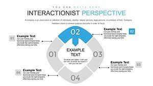
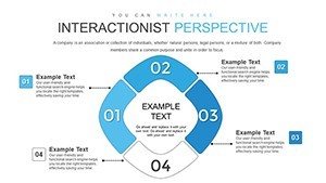
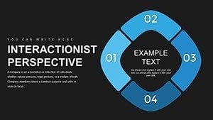
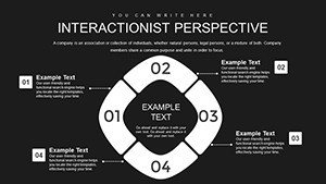
- Cycle-Based Charts: Circular layouts that depict perpetual social processes, ideal for showing reciprocity.
- Key Element Emphasis: Tools to spotlight norms, roles, and status with colors and icons.
- Full Customization: Edit in PowerPoint to fit your research focus, including text and graphics.
- Animation Support: Rotate cycles dynamically to simulate interaction flows.
- Balanced Design: Ensures clarity and relevance, adhering to effective visualization principles.
This goes beyond standard charts by embedding sociological relevance, enhancing through accurate representations.
Field Applications: From Classroom to Conference
In academic lectures, use cycles to dissect family dynamics, showing how parental roles influence child identities per interactionist views. Researchers can map institutional impacts, like schools reinforcing status through peer interactions, citing studies from the American Sociological Association.
For policy analysts, illustrate media's cycle in shaping public opinion, with examples from election cycles. A case study: Sociologists at conferences have used similar visuals to present on urban inequality, cycling through community interactions to highlight systemic issues.
Guide to Tailoring Your Sociological Cycles
- Define Your Focus: Select slides for specific theories, like dramaturgical analysis.
- Add Content Layers: Incorporate quotes, data, or images from ethnographic research.
- Refine Visuals: Use subtle colors for emotional tones in interactions.
- Animate Interactions: Build elements to show sequential developments.
- Validate and Present: Cross-check with peers for theoretical accuracy.
Tip: Balance elements as per design experts - avoid overload to maintain focus on key insights.
Authoritative Insights in Social Visualization
Anchored in core interactionist principles, this template draws from authoritative texts, ensuring trustworthiness. ASA guidelines emphasize visual aids for complex theories, and this delivers. Collaborate via Google Slides imports, or use in hybrid seminars.
Expand by linking to empirical data, creating a robust analytical tool.
Navigating Conceptual Challenges
Abstract ideas like status fluidity are concretized through cycles, reducing confusion. In diverse audiences, adapt for cultural contexts, promoting inclusive sociology.
Its design fosters deep engagement, turning presentations into dialogues.
Unlock Sociological Insights Now
Dive into the cycles of society with our Interactionist Perspective Template. 28 slides await your expertise - customize and captivate. Advance your work today - acquire this resource!
Frequently Asked Questions
How does this template represent interactionist concepts?
Through cycles that show ongoing social exchanges, with editable elements for norms and roles.
Is it suitable for non-sociologists?
Yes, educators in related fields like psychology can adapt it for interpersonal dynamics.
Can I incorporate external data?
Absolutely, placeholders allow seamless integration of research stats.
What makes the design effective?
It prioritizes clarity and balance, simplifying complex theories without losing depth.
Are animations included?
Yes, ready for customization to enhance cycle flows.