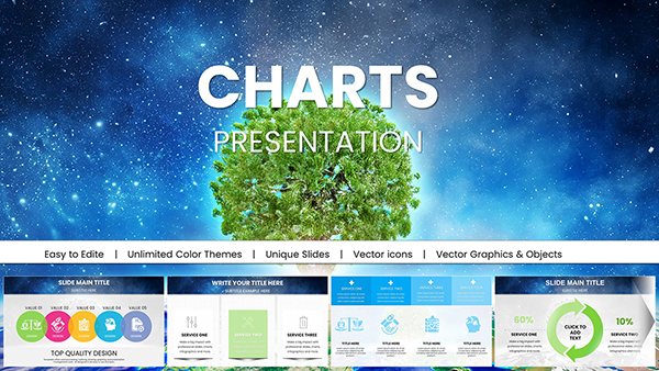
Creating engaging presentations requires clear, visually appealing data visualization. Our color PowerPoint chart templates are designed to help you communicate complex data effectively in business meetings, academic lectures, or professional workshops. Aligned with design trends, these editable PPT charts combine vibrant aesthetics with functionality to make your presentations stand out. Whether you need pie charts, bar graphs, or gradient visuals, our templates ensure professional results.
Colorful charts transform raw data into compelling stories. Here`s why our templates are the best choice for your presentations:
Fully Customizable: Adjust colors, sizes, and data to match your brand or project.
Professional Design: Perfect for business, education, marketing, or financial presentations.
Trend-Focused: Built, with modern gradients and sleek layouts.
Time-Saving: Pre-designed charts let you focus on content, not design.
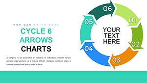
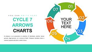
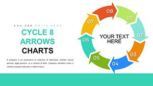
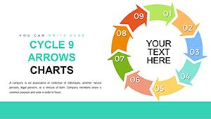
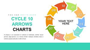
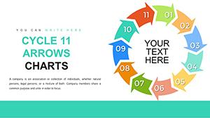
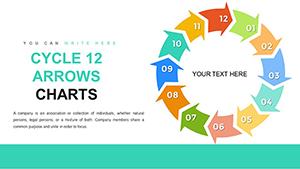
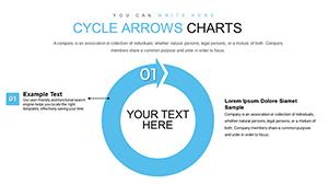
Top 5 PowerPoint Chart Types for Data Visualization
Choosing the right chart type enhances your presentation`s impact. Explore our top chart templates:
Gradient Chart Templates
Gradient charts use smooth color transitions to highlight trends, making them ideal for financial data, sales growth, or stock price visuals. Their dynamic design captivates audiences while maintaining clarity. Download Gradient Charts.
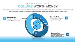
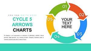
Pie Chart Templates
Pie charts excel at showing proportions, such as market share or budget allocations. Our editable pie chart templates use vibrant colors for quick comprehension. Explore Pie Charts.
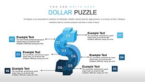
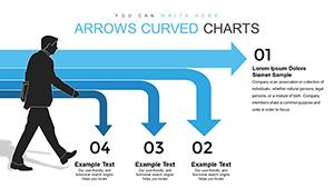
Bar Chart Templates
Bar charts are perfect for comparing data sets, like sales across regions or product performance. Our templates offer clean, customizable designs. View Bar Charts.
Line Chart Templates
Line charts track trends over time, ideal for stock prices, performance metrics, or weather patterns. Our templates simplify complex data with clear lines. Download Line Charts.
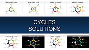
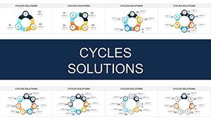
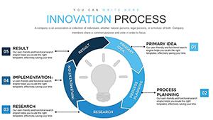
Radar Chart Templates
Radar charts visualize multiple variables, like survey results or customer satisfaction. Their unique spider-web design adds a modern touch. Explore Radar Charts.
Benefits of Using Our PowerPoint Chart Templates
Our templates are designed to elevate your presentations. Key advantages include:
High-Quality Graphics: High-resolution visuals ensure professional output on any screen.
Versatility: Suitable for industries like finance, marketing, education, and tech.
SEO-Optimized Design: Aligns with data visualization best practices to boost engagement.
User-Friendly: Easy to edit, even for beginners, with no advanced design skills needed.
How to Use PowerPoint Chart Templates Effectively
Maximize the impact of your charts with these tips:
Choose the Right Chart: Match the chart type to your data (e.g., pie for proportions, line for trends).
Customize Colors: Use brand colors for consistency and professionalism.
Keep It Simple: Avoid clutter to ensure clarity and readability.
Test Your Slides: Verify charts are legible on projectors or shared screens.
Frequently Asked Questions
What formats are available for PowerPoint chart templates? All templates are downloadable as PPTX files, compatible with PowerPoint 2016 and later versions.
Can I edit the PowerPoint chart templates? Yes, our charts are fully editable, allowing you to customize data, colors, and layouts to suit your needs.
Are there free PowerPoint chart templates available? We offer premium templates starting at $12, with occasional free samples. Visit our free templates page for details.
Download our top color PowerPoint chart templates today to create stunning, professional presentations. Whether you`re presenting financial data, marketing insights, or educational content, our templates ensure success.