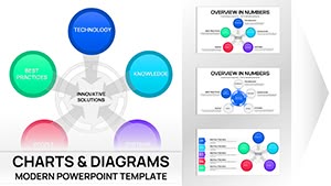
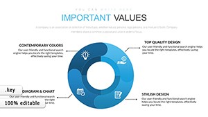
Circular charts in Keynote excel at depicting cycles, proportions, and relationships, from business workflows to scientific models. Our templates suit analysts diagramming strategies or designers mapping user journeys, with radial layouts that draw eyes to the center.
They provide intuitive editing - adjust arcs, add labels, trigger spins - and cohesive integration with slide themes. This format simplifies intricate data, making patterns pop for better comprehension and recall.
Crafted for dynamic presenters in consulting and education, they add motion to static info. Check out our circular designs to rotate your visuals.
Social Connections Keynote Charts: Visualize Networks with Impact
ID: #KC00376
$15.00
(132)
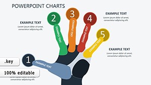
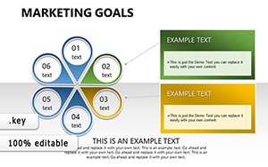
Marketing Charts Keynote Template
ID: #KC00345
$19.00
(500)
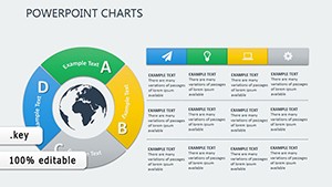
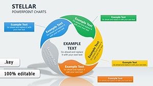
Stellar Cycle Charts Keynote Template: Illuminate Data Relationships
ID: #KC00277
$15.00
(466)
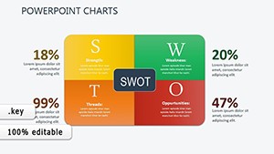
Business Plan Pie Charts for Architects
ID: #KC00276
$15.00
(639)
Dynamic Marketing Keynote Charts: Ignite Your Strategy Sessions
ID: #KC00248
$17.00
(665)
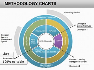
Methodology Keynote Charts Template: Streamline Your Business Narratives
ID: #KC00226
$24.00
(542)
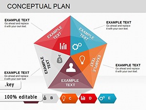
Conceptual Plan Charts for Keynote: Piece Together Complex Ideas
ID: #KC00225
$19.00
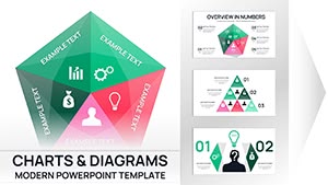
Standout Qualities of Circular Templates
With rotatable segments and gradient fills, they outpace linear alternatives for holistic views. A sustainability report could spin a pie chart to emphasize renewable shares, engaging viewers kinesthetically.
Core Use Cases for Circular Visuals
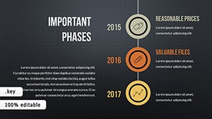
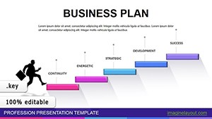
Process Mapping: Workflow cycles showing step interdependencies.
Budget Allocations: Donut charts breaking down expenditures.
Feedback Loops: Radial diagrams for customer sentiment analysis.
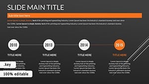
Timeline Wheels: Historical events in concentric rings.
Breadth covers from quarterly reviews to annual recaps.
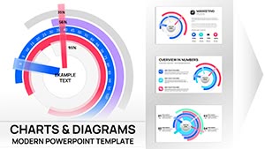
Refining Circular Charts in Keynote
Balance segments proportionally, then animate wedges outward. Employ shadows for depth in 3D rings. Consider a product lifecycle chart pulsing segments to lifecycle phases.
Pair with legends positioned radially to avoid disruption.
Creative Twists to Implement
Interlinked circles: Venn-style for overlaps.
Animated rotations: Full spins for emphasis.
Color-coded arcs: Thematic hues for quick reads.
These elevate charts from descriptive to demonstrative.
Spin Your Data into Action
Choose a template and cycle through customizations. Make every turn count in your Keynote.