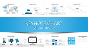
Infuse elegance into your data with Keynote chart templates optimized for Apple`s ecosystem. Geared toward designers, executives, and educators on Mac, these templates harness Keynote`s fluid animations and precise controls for stunning results.
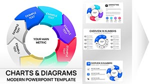
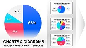
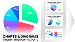
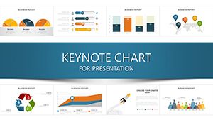
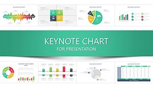
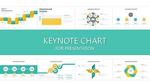
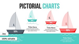
Suitable for investor pitches, academic lectures, or design reviews, they offer charts like sunbursts, timelines, and 3D models that pop on Retina displays. Effortlessly import from Numbers for live updates, maintaining sync across devices.
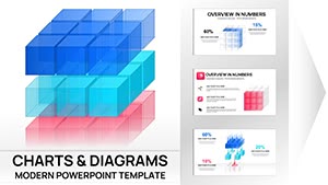
With vector-based scalability and theme harmony, your charts will exude professionalism. Tailor to narratives, from growth trajectories to comparative analyses, captivating audiences effortlessly.
Delve into our Apple-centric collection and elevate your Keynote mastery.
Built-in charts feel utilitarian; ours infuse artistic flair with custom bezels and shadows for depth. Defaults limit animation finesse; our presets leverage Keynote`s magic move for fluid data shifts.
Superior integration with iCloud ensures collaborative edits without version conflicts.
Customization Essentials
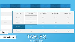
Align with system fonts for native feel. Use build-ins for sequential data entry. Export to PDF for universal sharing.
Practical Inspirations
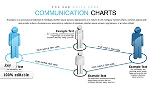
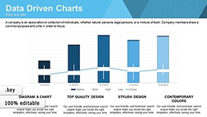
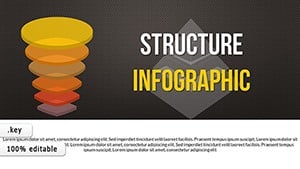
A filmmaker charted scene breakdowns with story arcs, streamlining edits. An app developer animated user flow funnels, clarifying UX paths. Wellness coaches tracked habit metrics via radial dials, motivating clients visually.
Fuse with shapes for bespoke hybrids. Leverage Magic Draw for hand-sketched vibes.
Polish Your Keynote Charts
Calibrate colors for accessibility. Rehearse timings for sync. Backup via iCloud.
Curate from our lineup and download for refined data artistry. Let charts choreograph your message.